A full UX/UI redesign of a mobile booking app for trains and coaches across the UK — approached through the Double Diamond framework, from in-depth discovery research through to defined problem statements, wireframes, a design system and interactive prototypes.
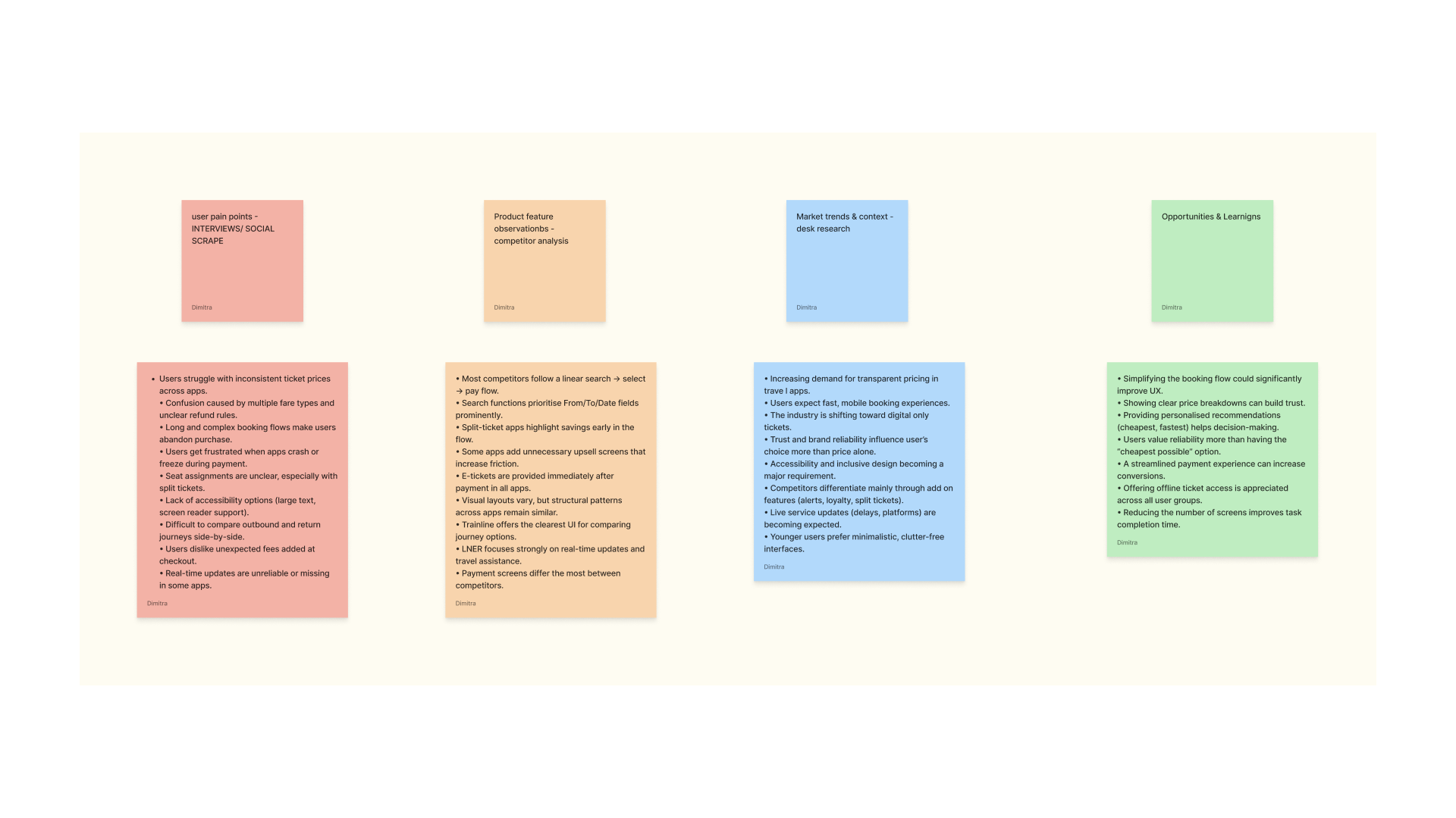
TravelXpress is a redesign of a mobile app for booking trains and coaches across the UK, built around the Double Diamond framework. The Discover phase focused on research and exploration — deeply understanding the problem space by gathering insights about users, their behaviours, frustrations, motivations and needs through interviews, surveys, customer journey mapping, desk research, social scraping and competitor analysis.
The goal of this phase was to build a rich understanding of users and the context, supporting divergent thinking and opening up the problem space before any solutions were considered.
Design Approach — Strategy
The Define phase turned the research from Discover into clear, structured insights — using affinity diagramming, personas, archetypes, jobs-to-be-done analysis, empathy mapping, problem statements and How Might We questions to pinpoint the core user needs and the specific problems worth solving.
This synthesis supported convergent thinking, narrowing the insights down to identify key challenges and prepare for ideation — resulting in lo-fi wireframes, a design system and interactive prototypes tested across desktop and mobile.
A Quick Look Ahead
Where this journey landed
Before diving into the research — here's a glimpse of the final TravelXpress app, built from everything that follows.
Investigating how users navigate the app, identifying where they struggle — payment, seat selection, disruptions — and uncovering what motivates or frustrates them during the booking and travel planning process.
01
Identify user needs and expectations — exploring what users value most, such as transparency, reliability, ease of use, and quick access to information, to determine which features or improvements would meaningfully enhance their experience.
02
Validate and cross-check insights through mixed methods — using interviews, surveys, social scraping and journey mapping to confirm recurring patterns in user feedback, grounded in both qualitative and quantitative data.
03
Analyse the competitive landscape — examining competitor apps to identify best practices, gaps in the market, and successful features that could inspire opportunities for differentiation and improvement.
04
Build a comprehensive understanding of the broader context — conducting desk research to understand industry trends, standards and emerging behaviours in mobility and booking systems.
05
Synthesise findings into actionable design opportunities — organising research insights into themes that highlight key issues, such as lack of transparency, unstable seat maps, slow loading times and poor disruption handling.
Research Methods
Discovery Phase
The Discover phase focused on research into competitors and user flows to understand how people use the app. User interviews were conducted to get qualitative information and discover what frustrates and motivates users, as well as what they prefer. Surveys & questionnaires provided broader insight and helped confirm — or challenge — the findings from the interviews. Customer journey mapping visually presented the steps users take while using the app and how each step makes them feel, plotted against pain points, emotions and opportunities for improvement.
Secondary research included desk research — reading published articles, watching video reviews, and reviewing books and studies relevant to the subject — to understand industry trends and standards. Social scraping researched user reviews on social media to gain real, unfiltered pain points directly from users. Competitor analysis helped identify user feedback patterns, successful features, gaps in the market and best practices across the category.
User Interviews
One-to-one conversations conducted to get qualitative information on what frustrates, motivates and what users prefer when booking travel.
Surveys & Questionnaires
Broader quantitative insight used to confirm — or challenge — the patterns surfaced through one-to-one interviews.
Journey Mapping
A visual presentation of the steps users take while using the app, and how they experience the whole process — charted with pain points, emotions and opportunities.
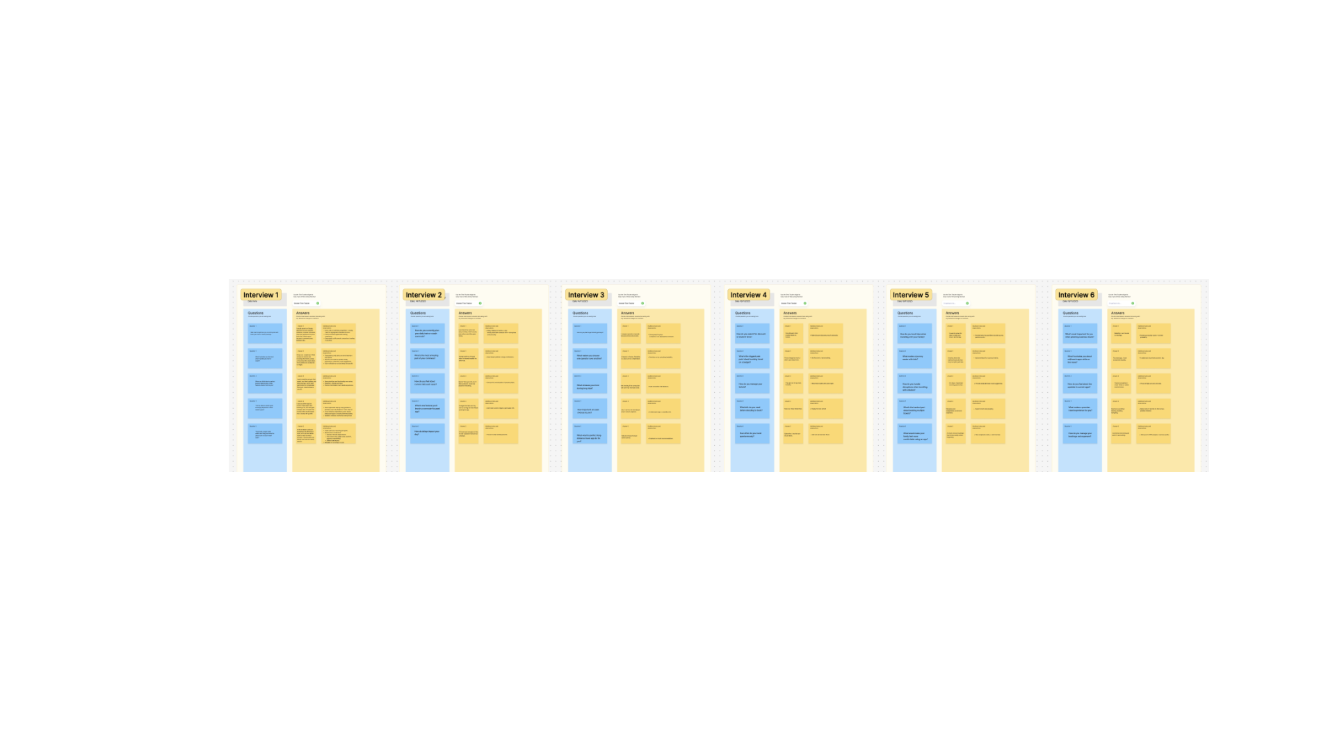
User Interviews — research boards
Surveys & Questionnaires — questions, answers & insight per persona segment
Key Insights
Recurring themes from the research
The main findings were grouped into themes around user behaviours, needs and frustrations.
Transparency
Users often abandon the booking process at the payment step due to unclear fees.
Reliability
Many users complain about unstable seat maps and slow-loading availability, especially during peak travel times.
Simplicity
People enjoy the simplicity and reliability of QR ticketing across trains and coaches.
Secondary Research
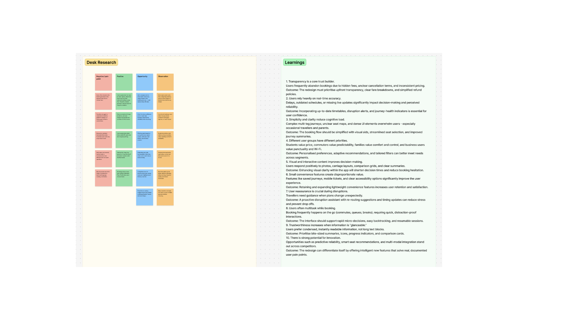
Desk Research
Published articles, video reviews, books and studies were reviewed to build a foundation of knowledge on booking systems and mobility trends ahead of the redesign.
01Transparency is a core trust builder.
Users frequently abandon bookings due to hidden fees, unclear cancellation terms, and inconsistent pricing. Outcome: the redesign must prioritise upfront transparency, clear fare breakdowns, and simplified refund policies.
02Users rely heavily on real-time accuracy.
Delays, outdated schedules or missing live updates significantly impact decision-making and perceived reliability. Outcome: incorporating up-to-date timetables, disruption alerts and journey-health indicators is essential for user confidence.
03Simplicity and clarity reduce cognitive load.
Complex multi-leg journeys, unclear seat maps and dense UI elements overwhelm users — especially occasional travellers and parents. Outcome: the booking flow should be simplified with visual aids, streamlined seat selection and improved journey summaries.
04Different user groups have different priorities.
Students value price, commuters value predictability, families value comfort and control, business users value punctuality and Wi-Fi. Outcome: personalised preferences, adaptive recommendations and tailored filters can better meet needs across segments.
05Visual and interactive content improves decision-making.
Users respond positively to photos, carriage layouts, comparison grids and clear summaries. Outcome: enhancing visual clarity within the app will shorten decision times and reduce booking hesitation.
06Small convenience features create disproportionate value.
Saved journeys, mobile tickets and clear accessibility options significantly improve the user experience. Outcome: retaining and expanding lightweight convenience features increases retention and satisfaction.
07User reassurance is crucial during disruptions.
Travellers need guidance when plans change unexpectedly. Outcome: a proactive disruption assistant with re-routing suggestions and timing updates can reduce stress and prevent drop-offs.
08Users often multitask while booking.
Booking frequently happens on the go — commutes, queues, breaks — requiring quick, distraction-proof interactions. Outcome: the interface should support rapid micro-decisions, easy backtracking and resumable sessions.
09Trustworthiness increases when information is "glanceable."
Users prefer condensed, instantly readable information, not long text blocks. Outcome: prioritise bite-sized summaries, icons, progress indicators and comparison cards.
10There is strong potential for innovation.
Opportunities such as predictive reliability, smart seat recommendations and multi-modal integration stand out across competitors. Outcome: the redesign can differentiate itself by offering intelligent new features that solve real, documented user pain points.
Secondary Research
Social Scrape
A scrape of real user reviews and posts across social media, gathering unfiltered pain points directly from travellers describing their experiences with existing booking apps.
01App stability and performance have a direct impact on user trust.
Frequent complaints about app crashes, freezing seat maps or payment resets show that technical reliability is a major expectation. Outcome: prioritise performance improvements, smooth load times and resilient payment flows.
02Real-time accuracy is a repeated user pain point.
Users consistently express frustration when delays or timetable changes in the app don't match what's shown at the station. Outcome: synchronising data sources and offering more reliable real-time updates is essential to credibility.
03Transparency around availability prevents user frustration.
Negative posts highlight confusion when trains or coaches labelled as "available" cannot actually be booked. Outcome: clear status indicators — sold out, limited seats, not bookable — reduce confusion and improve control.
04Small convenience features generate strong positive sentiment.
Auto-applied discounts, saved passenger details and quick mobile ticket access repeatedly receive praise. Outcome: enhancing these "micro-conveniences" can significantly boost perceived value and delight.
05Users want more context and reassurance during disruptions.
Many posts request clearer alternatives, guidance or explanations when delays occur. Outcome: adding disruption navigation — rerouting options, next fastest journey, easy refunds — can reduce anxiety in critical moments.
06Travellers rely on external platforms to fill app gaps.
People frequently check Twitter/X, Reddit or station staff for platform info, crowd levels or alternative routes. Outcome: incorporating platform alerts, crowd data and multi-modal suggestions creates a more complete ecosystem within the app.
07Seat selection remains an area of confusion and frustration.
Social comments reveal that users struggle with unclear or laggy seat maps, especially on mobile. Outcome: a clearer, more responsive seat-selection interface is essential for usability and conversion.
08Safety and clarity of pickup locations matter to coach users.
Late-evening travellers often mention feeling unsafe or unsure about where to wait for their coach. Outcome: detailed pickup visuals, lighting indicators and AR/map guidance can improve safety perception and reduce stress.
09Users exhibit price-conscious behaviour across platforms.
People openly compare screenshots, fares and apps when searching for the cheapest or fastest route. Outcome: integrating price-comparison tools or fare insights could reduce the need to juggle multiple apps.
Requests for quiet coach filters, seat preferences and crowd-level estimates suggest deeper personalisation is desired. Outcome: offering personalised recommendations can improve loyalty and make the booking experience feel tailored.
Secondary Research
Competitor Analysis
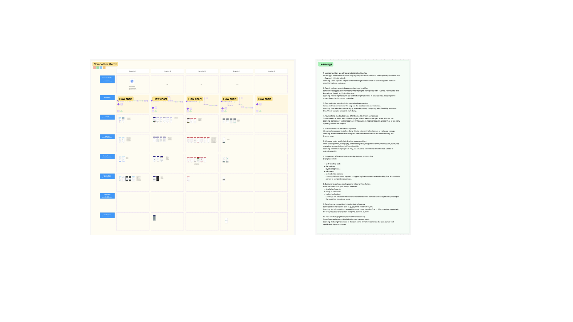
A matrix comparing existing train and coach booking apps across search, fare selection, payment, e-ticketing, UI and customer-experience factors, to identify best practices, gaps and opportunities for differentiation.
01Most competitors use a linear, predictable booking flow.
Every app shown follows a similar step-by-step sequence — Search → Select journey → Choose fare → Payment → Confirmation. Outcome: users expect a simple, forward-moving flow; non-linear or branching paths increase cognitive load and confusion.
02Search tools are almost always prominent and simplified.
Every competitor highlights key inputs — From, To, Date, Passengers — high in the interface. Outcome: prioritising the search bar and reducing the number of required fields improves conversion and reduces hesitation.
03Fare and ticket selection is the most visually dense step.
Across multiple competitors, this step has the most screens and variations. Outcome: fare selection must be highly scannable, clearly comparing price, flexibility and travel time.
04Payment and checkout screens differ the most between competitors.
Some use simple one-screen checkout, others use multi-step processes with add-ons. Outcome: consistency and transparency in the payment step is critical — unclear fees or too much upselling leads to drop-off.
05E-ticket delivery is unified and expected.
All competitors deliver digital tickets, often on the final screen or via in-app storage. Outcome: immediate ticket availability and clear confirmation details reduce uncertainty and improve trust.
06UI design varies widely, but structure stays consistent.
Colour palette, typography and branding differ, but layout patterns — tabs, cards, top navigation — remain stable. Outcome: the visual language can vary, but structural conventions should remain familiar to maintain usability.
07Competitors differ most in value-adding features, not core flow.
Split-ticketing tools, live updates, loyalty integrations, price alerts, seat selection options. Outcome: differentiation happens in supporting features, not the core booking flow.
08Customer experience scoring seems linked to three factors.
Simplicity of search, clarity of selections, friction in checkout. Outcome: the smoother the flow and the fewer screens required to finish a purchase, the higher the perceived experience score.
09Gaps in some competitors indicate missing features.
Some columns have blank rows — e.g. payment, confirmation, UI. Outcome: not all competitors support the same comprehensive flow — an opportunity to offer a more complete, polished journey.
Some flows are long and detailed; others are more compact. Outcome: reducing the number of decision points in the flow can make the user journey feel significantly lighter and faster.
Customer Journey Mapping
Seven journeys, seven mindsets
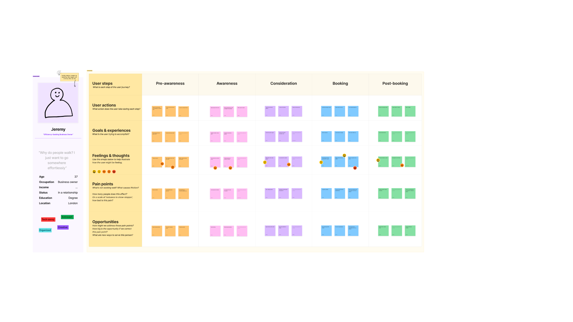
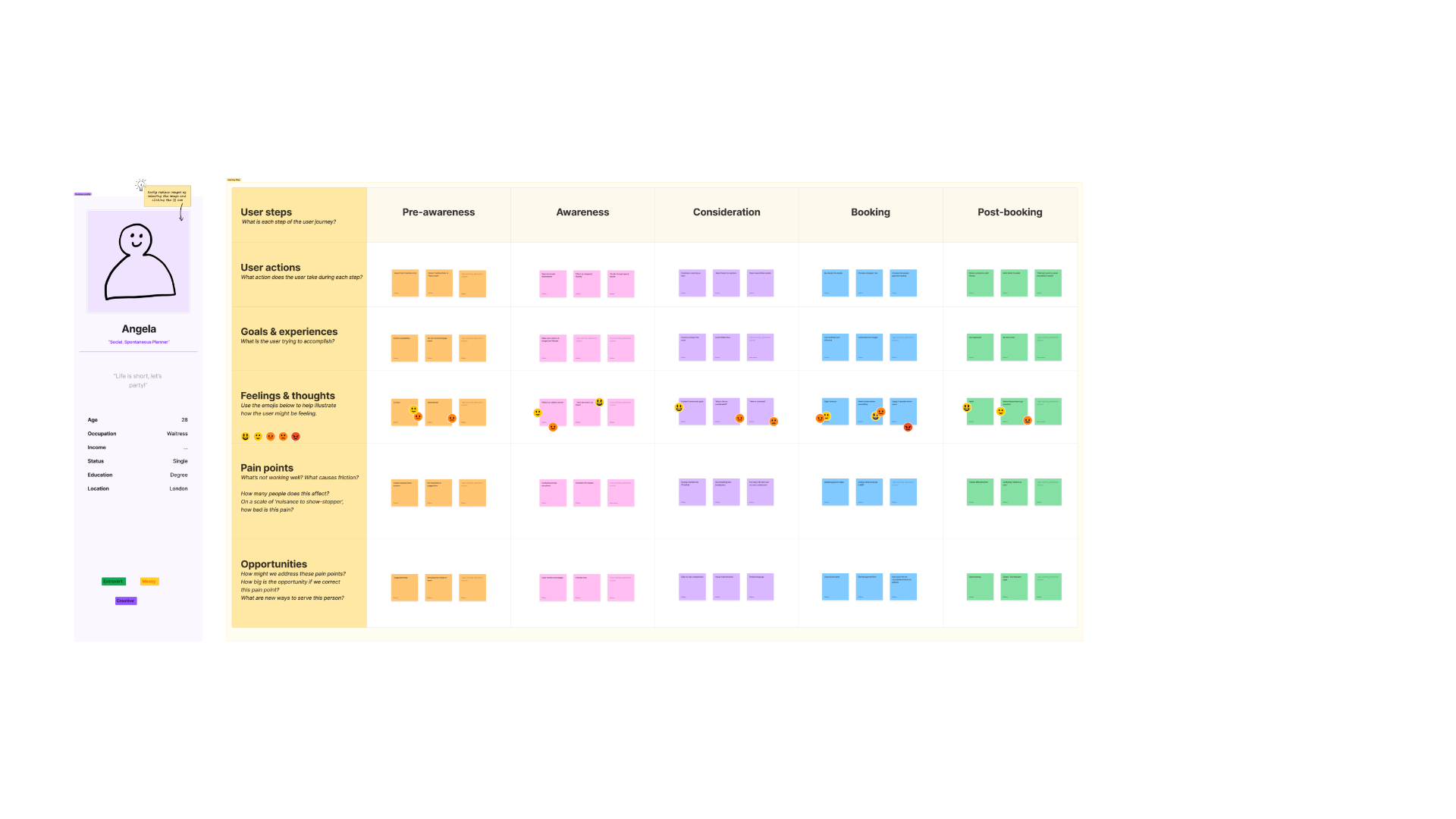
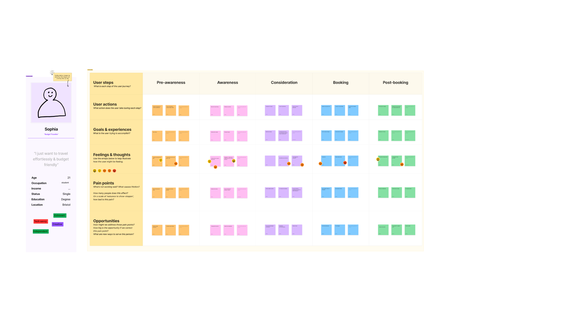
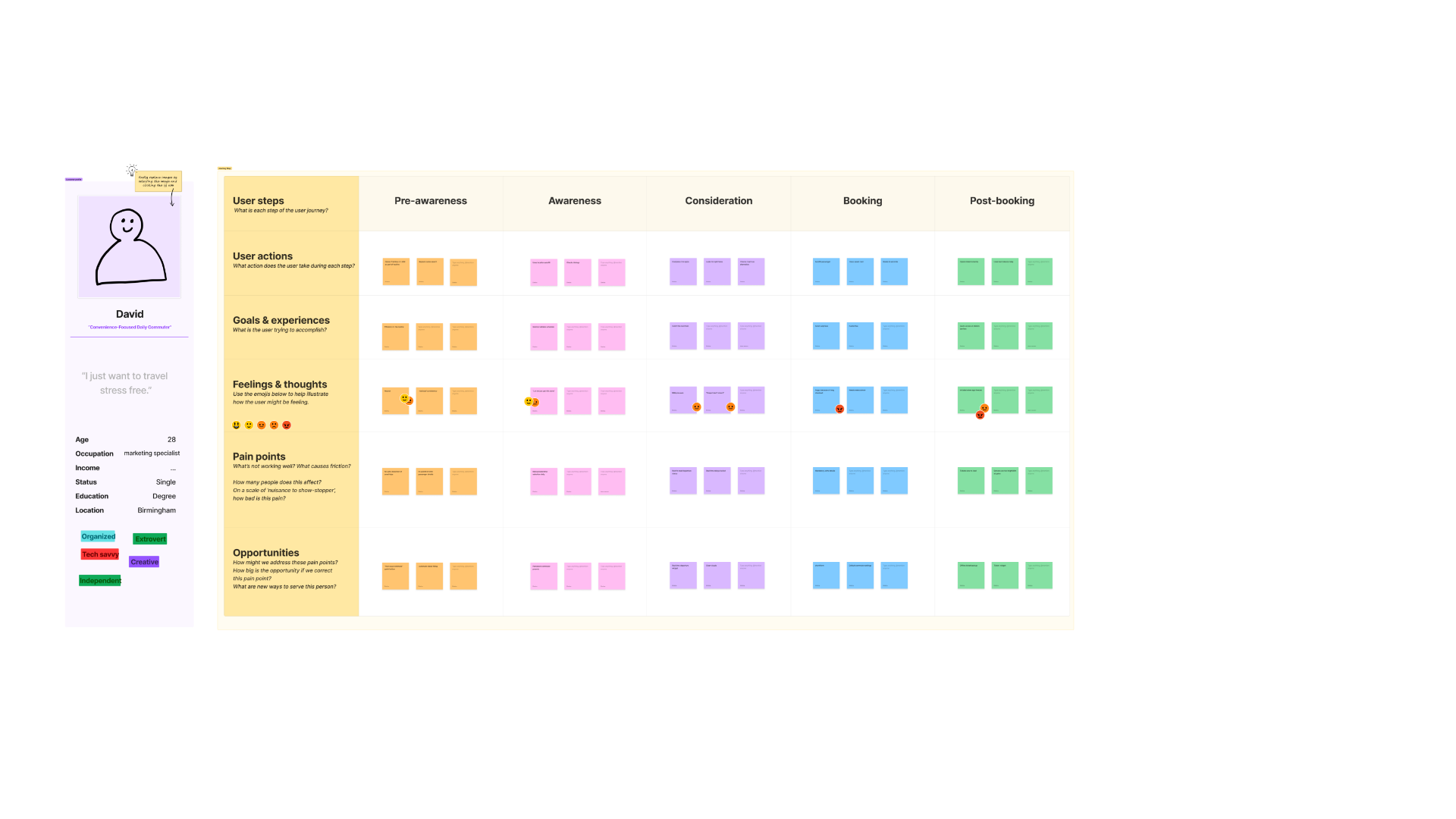
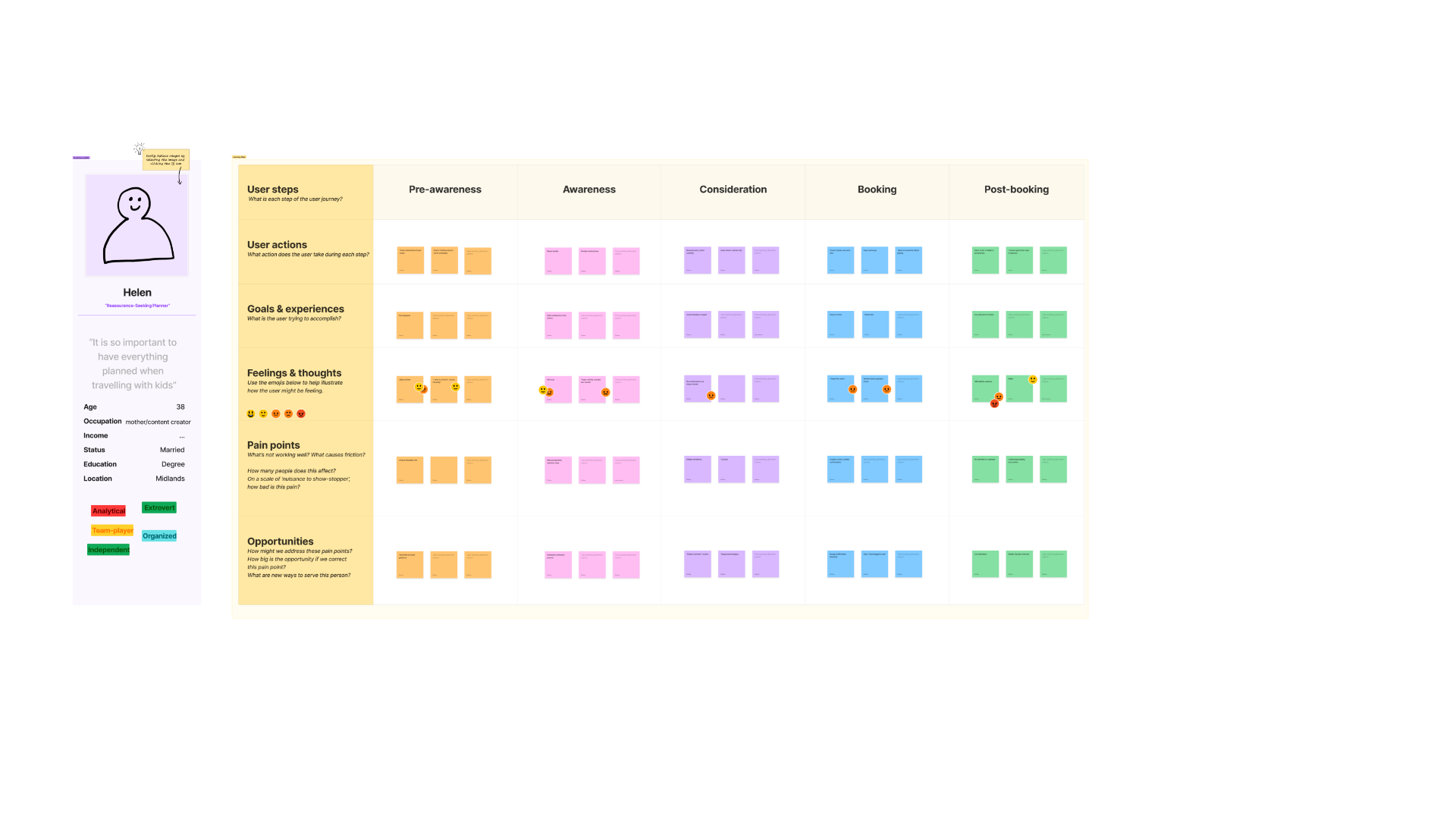
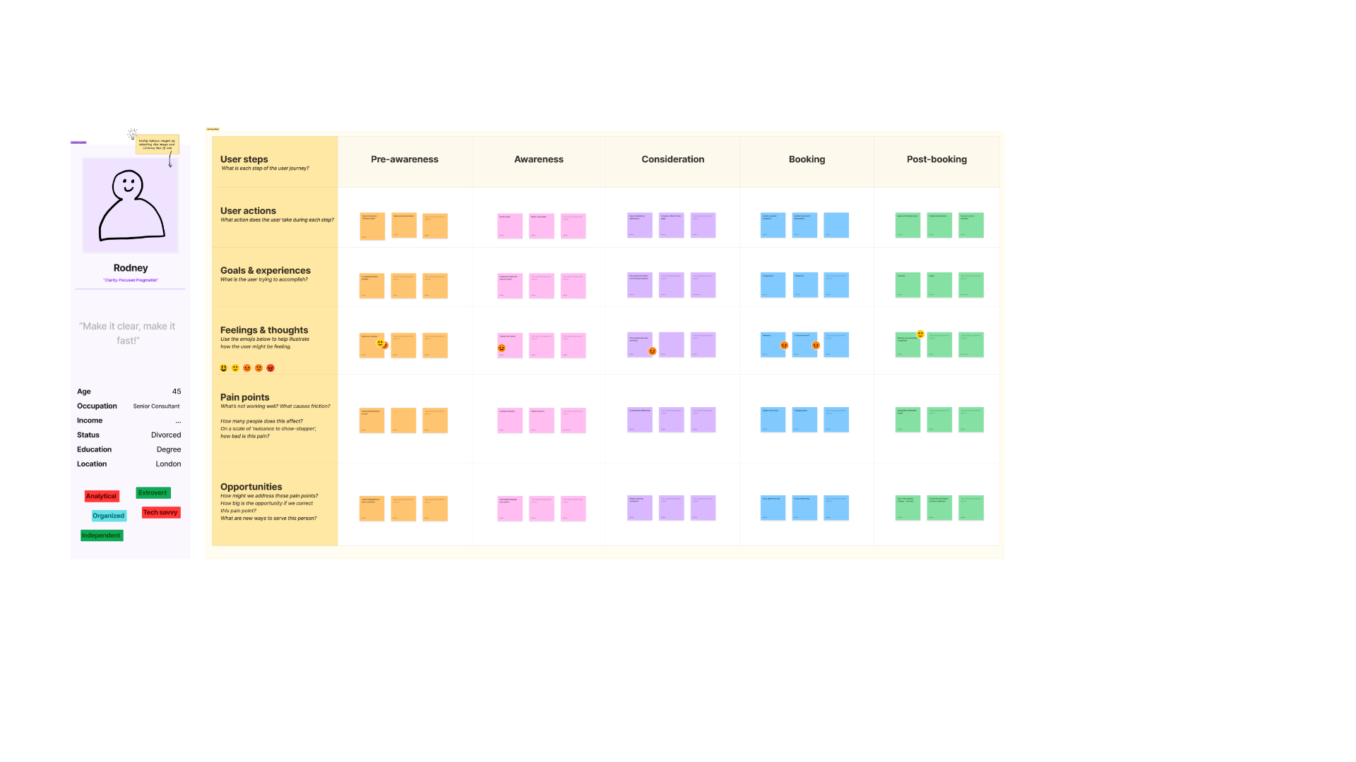
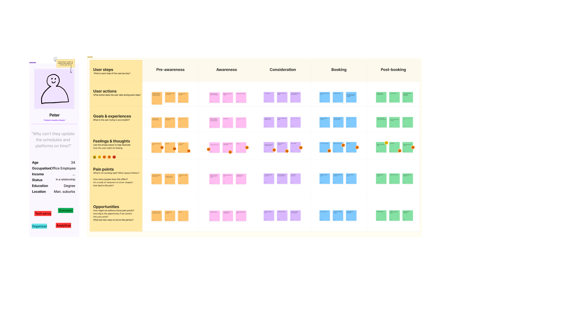
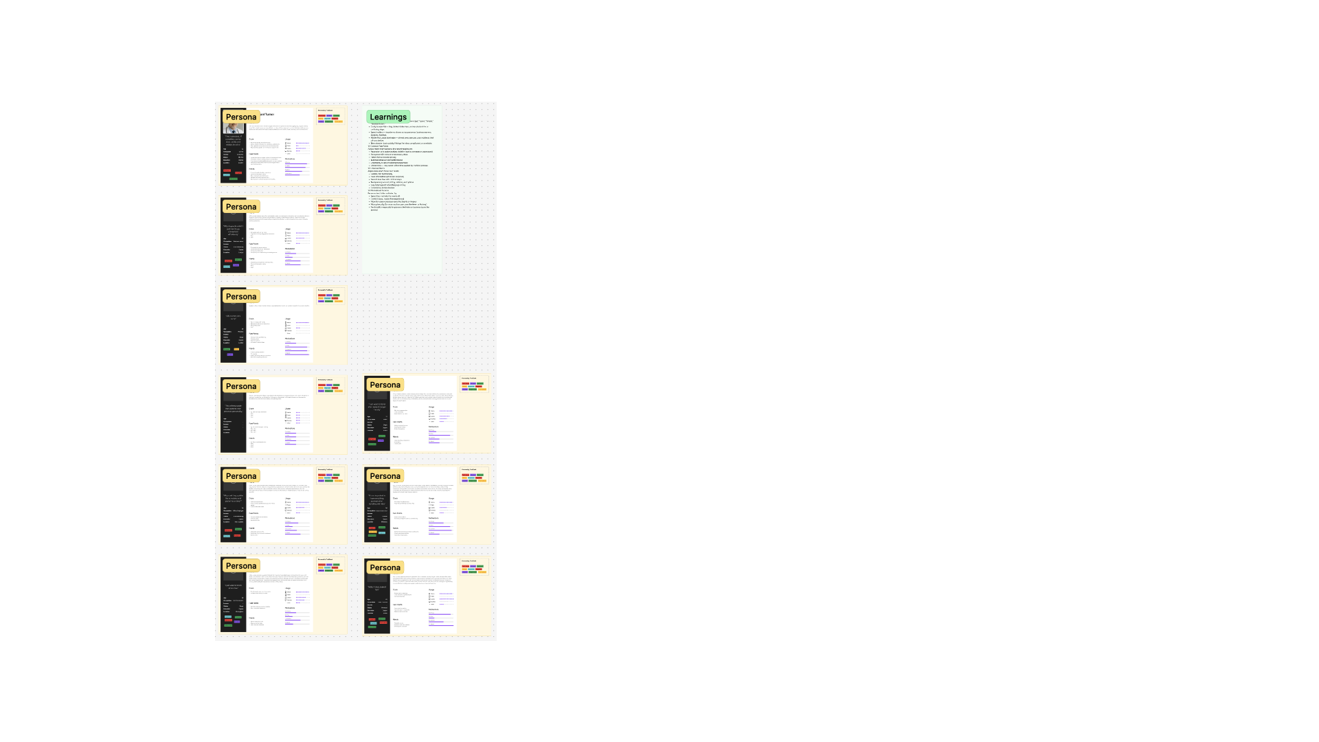
Each journey map traces one persona's steps, actions, feelings and pain points across five stages — pre-awareness, awareness, consideration, booking, and post-booking — surfacing distinct, sometimes conflicting, needs.
Jeremy
"Efficiency-Seeking Business Owner"
37 · Business Owner · In a relationship · London — "Why do people walk? I just want to go somewhere effortlessly."
Learnings: Time is more important than price. Any friction — slow load, clutter, long forms — immediately causes abandonment. He wants predictable, fast, reliable routes, prefers "one-tap" and automation, and trusts speed and clarity over brand or design.
Angela
"Social, Spontaneous Planner"
28 · Waitress · Single · London — "Life is short, let's party!"
Learnings: Sees travel as part of social plans, not a logistical burden. Enjoys browsing options but gets overwhelmed by complexity, needs friendliness, clarity and recognisable deal indicators, and wants reassurance but not too much detail.
Sophia
"Budget Traveller"
21 · Student · Single · Bristol — "I just want to travel effortlessly & budget friendly."
Learnings: Savings are the primary driver, even if the route is slower. Sensitive to hidden fees and misleading "savings" claims, often cross-checks apps to confirm price, and has low trust in apps that hide costs until checkout.
David
"Convenience-Focused Daily Commuter"
28 · Marketing Specialist · Birmingham — "I just want to travel stress free."
Learnings: Wants repeatability, minimal choices and consistent flows. Sees booking as part of his daily routine and wants automation and shortcuts — real-time accuracy matters more than UX polish, and he's easily frustrated if everyday actions take longer than expected.
Helen
"Reassurance-Seeking Planner"
38 · Mother / Content Creator · Married · Midlands — "It is so important to have everything planned when travelling with kids."
Learnings: Needs emotional safety and clarity at every step. Gets overwhelmed by too many options or unclear fare rules, double-checks information and fears making mistakes, and prefers "explain like I'm new" type designs.
Rodney
"Clarity-Focused Pragmatist"
45 · Senior Consultant · Divorced · London — "Make it clear, make it fast!"
Learnings: Wants transparency, not speed or savings. Needs simple explanations of complex rail concepts, gets stuck when terminology is confusing, and doesn't tolerate unclear fees or vague route descriptions.
Peter
"Problem-Sensitive Skeptic"
34 · Office Employee · In a relationship · Manchester suburbs — "Why can't they update the schedules and platforms on time?"
Learnings: Deeply distrustful of digital travel systems due to past negative experiences. Hyper-alert to errors and unclear information — even small issues feel like major deal-breakers — and prefers redundancy: multiple tickets, confirmations, fallback options.
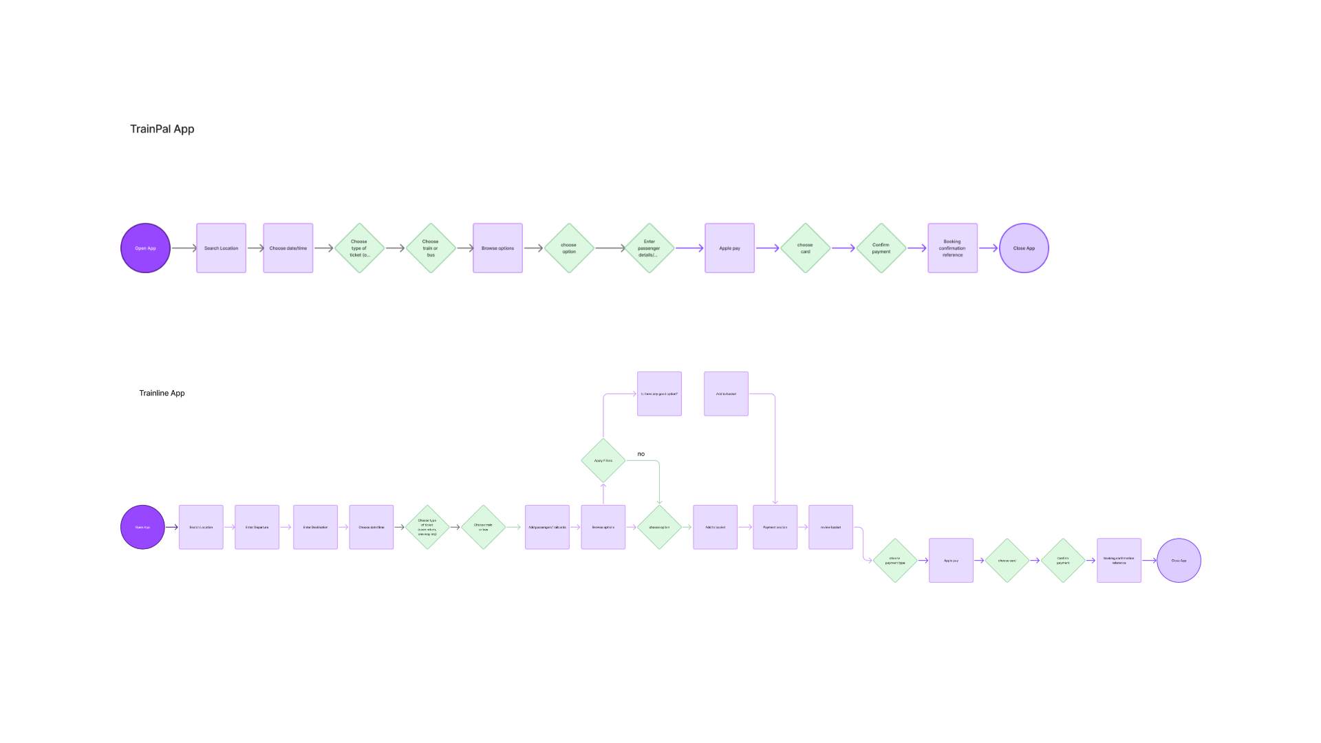
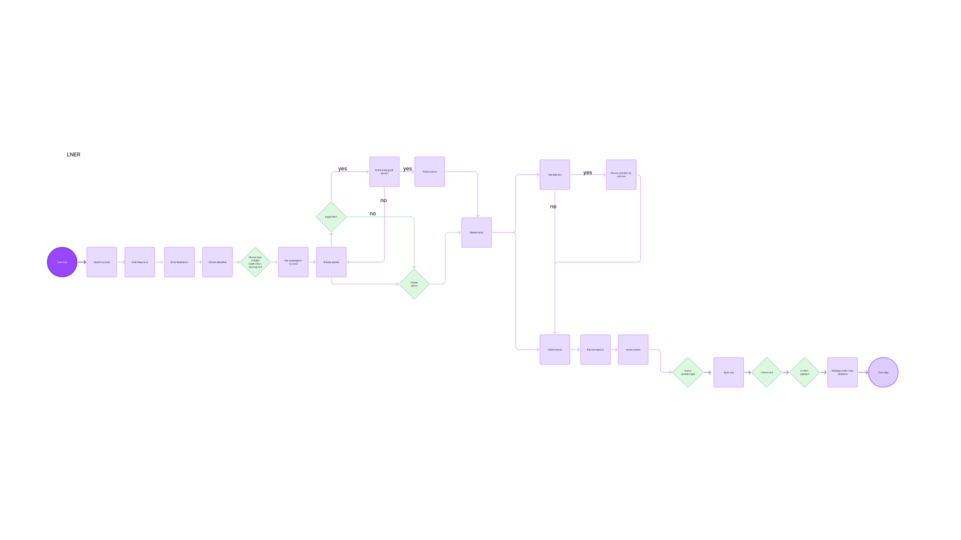
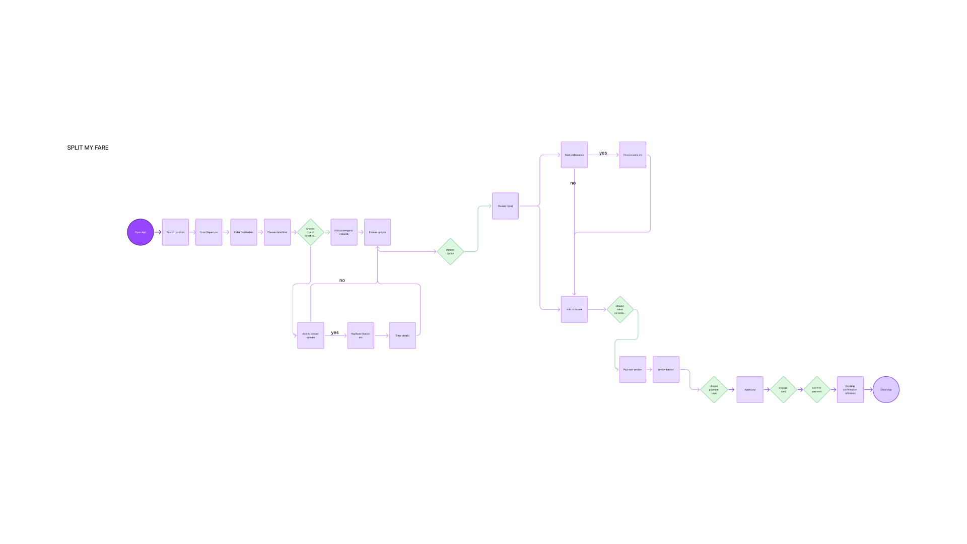
Existing Product Analysis
Mapping the current user flow
Before redesigning, the existing product's end-to-end user flow was mapped in detail — from entry point through search, selection, payment and confirmation — to pinpoint exactly where friction, dead ends and unnecessary steps occur.
Define Phase
Synthesising the insights
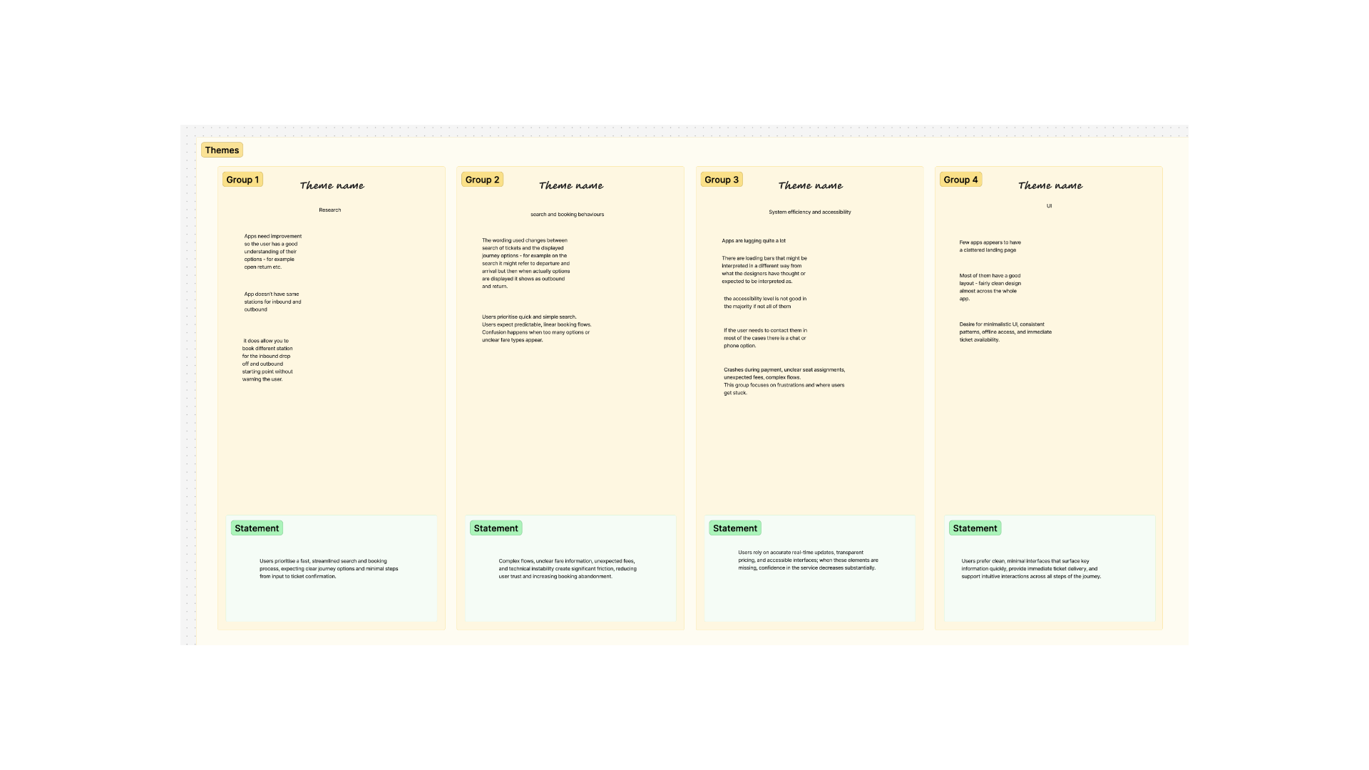
Affinity diagramming was used to sort and organise the research data — grouping information into connections that proved pivotal for solving user problems, and documenting large amounts of data while highlighting what users need, dislike or experience.
User Profiling
Personas & Archetypes
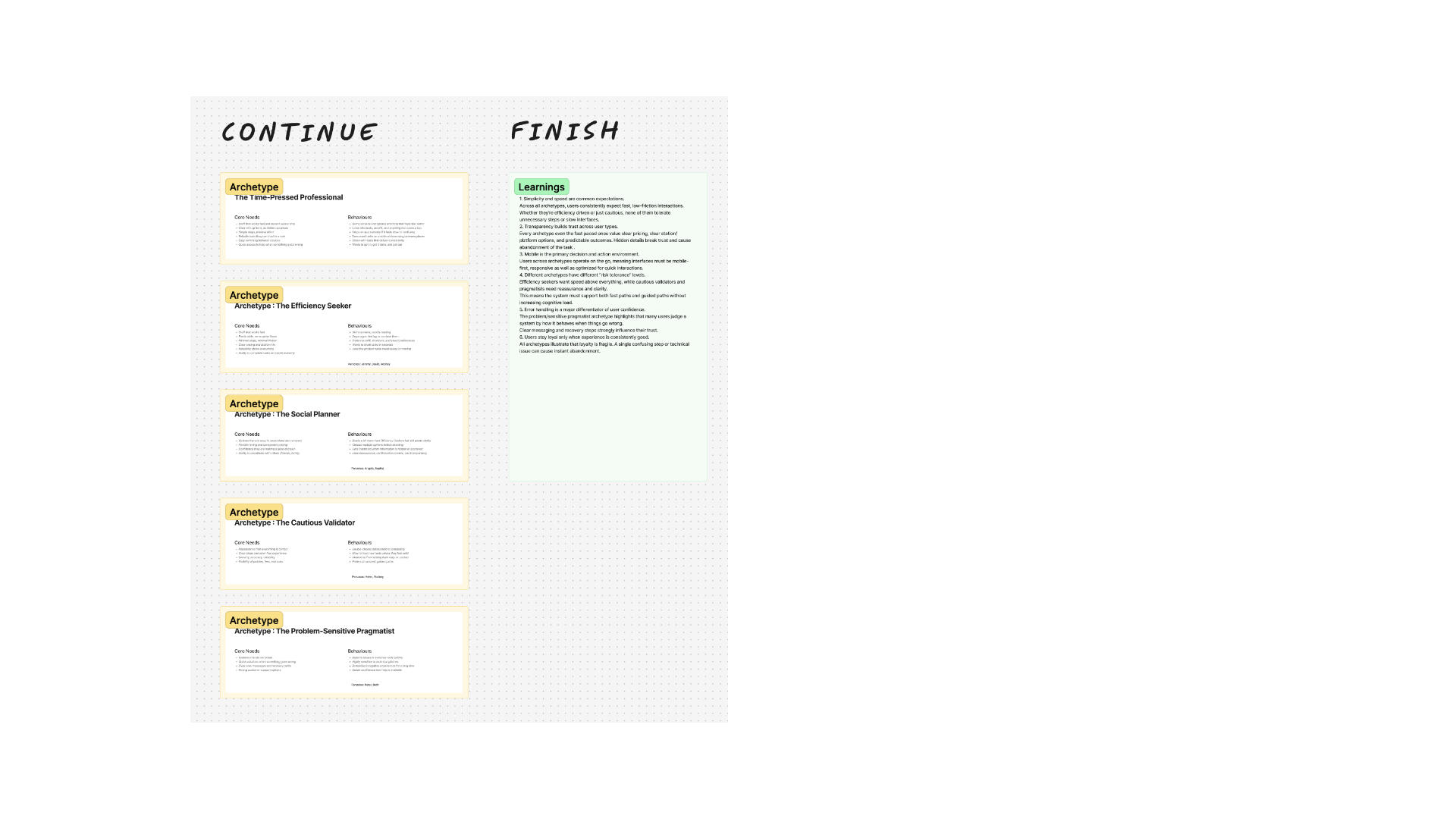
User personas are fictional, representative profiles that capture the key characteristics of a typical user — helping the team empathise with specific needs and design with a clear picture of who they're designing for: The Problem-Sensitive Pragmatist, The Cautious Validator, The Social Planner, and others drawn directly from the journey mapping work above.
Archetypes strip the persona back to behaviour alone, without demographic detail — allowing the design to focus on behavioural motivation rather than individual identity.
The Efficiency Seeker
Minimal steps, minimal friction.
The Social Planner
Ability to coordinate with others — friends, family.
The Cautious Validator
Clear steps and an error-free experience.
Define Phase
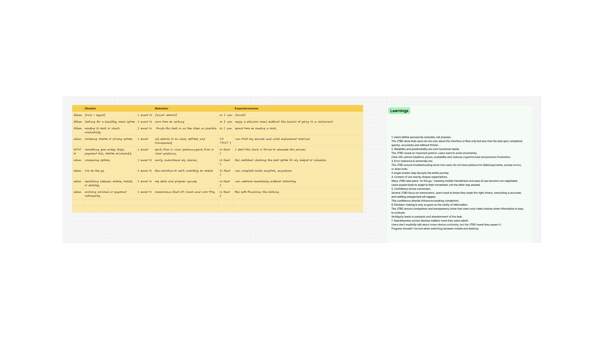
Jobs To Be Done
Understanding why users use the app — the exact need, job or task they want satisfied — to uncover motivations that aren't immediately obvious and surface more targeted design solutions.
"When reviewing station or pricing information, I want all details to be clear, upfront and transparent, so that I can trust my decision and avoid any unpleasant surprises."
Define Phase
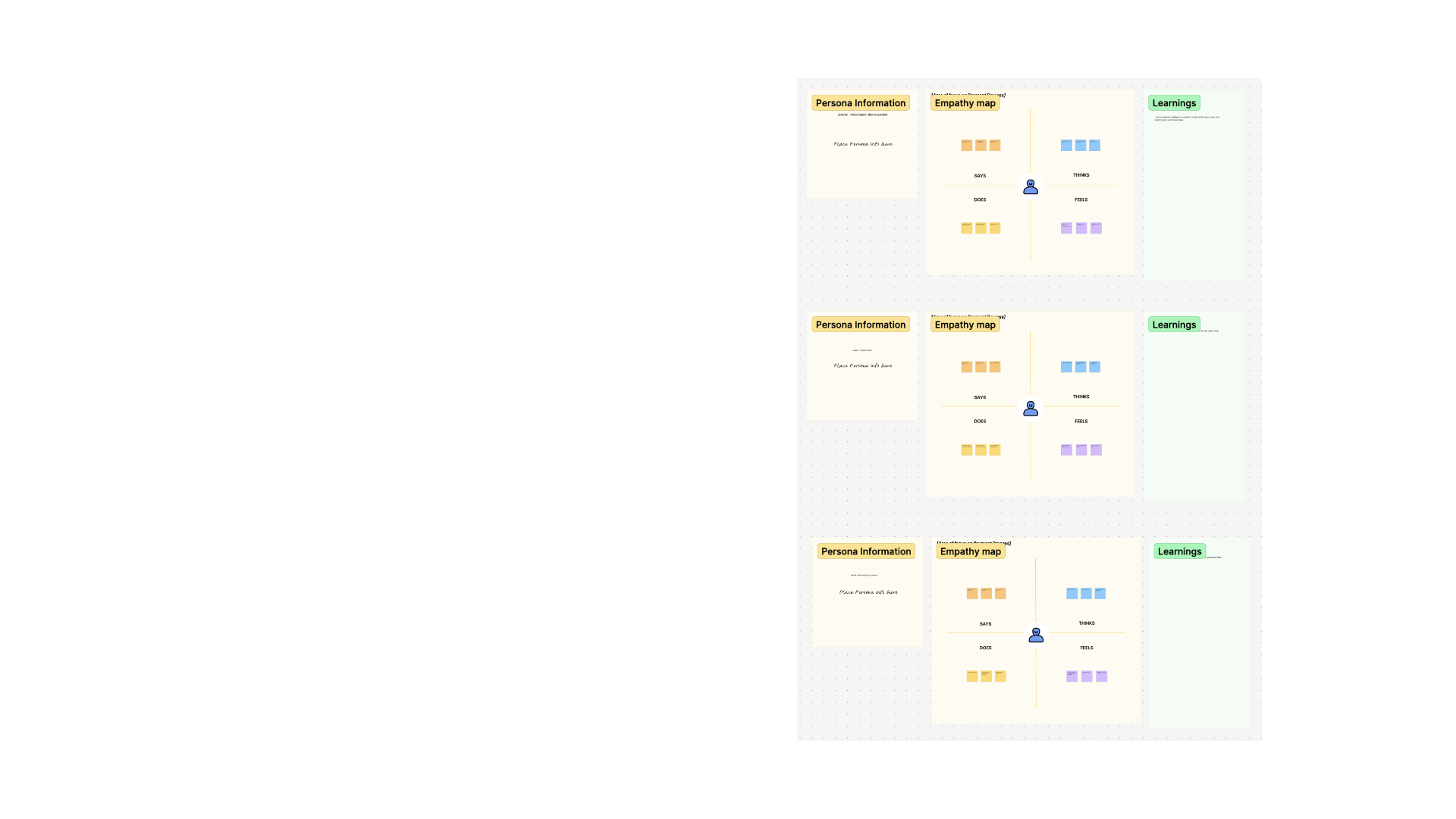
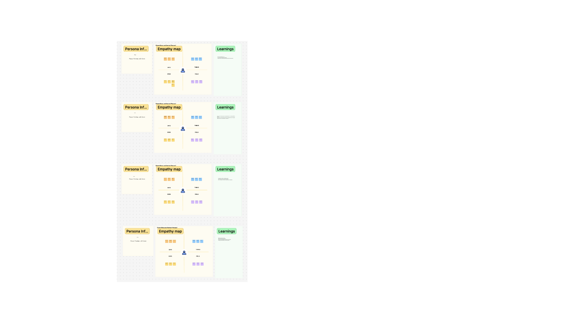
Empathy Mapping
A visual technique that breaks down the user experience into four sections — Feel, Think, Say, Do — clarifying what users experience while using the app and guiding subsequent design decisions.
Define Phase
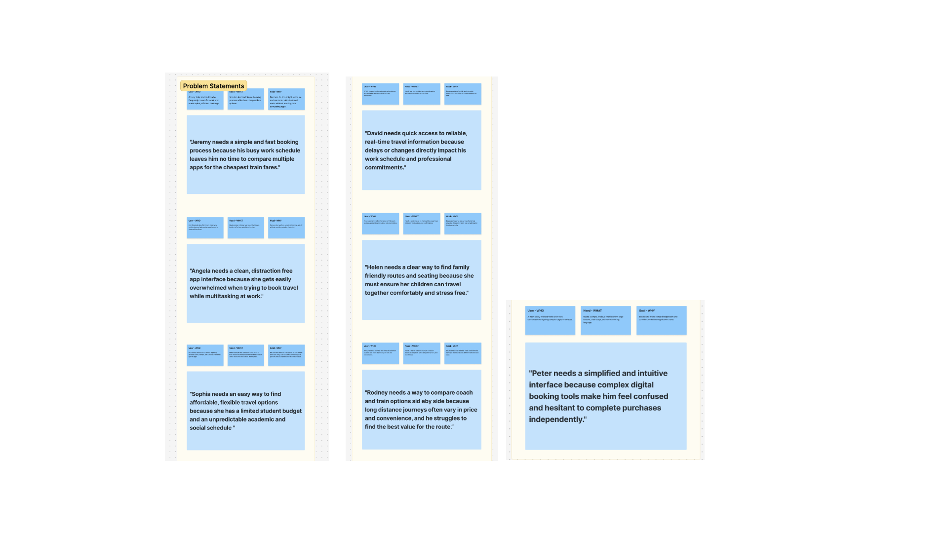
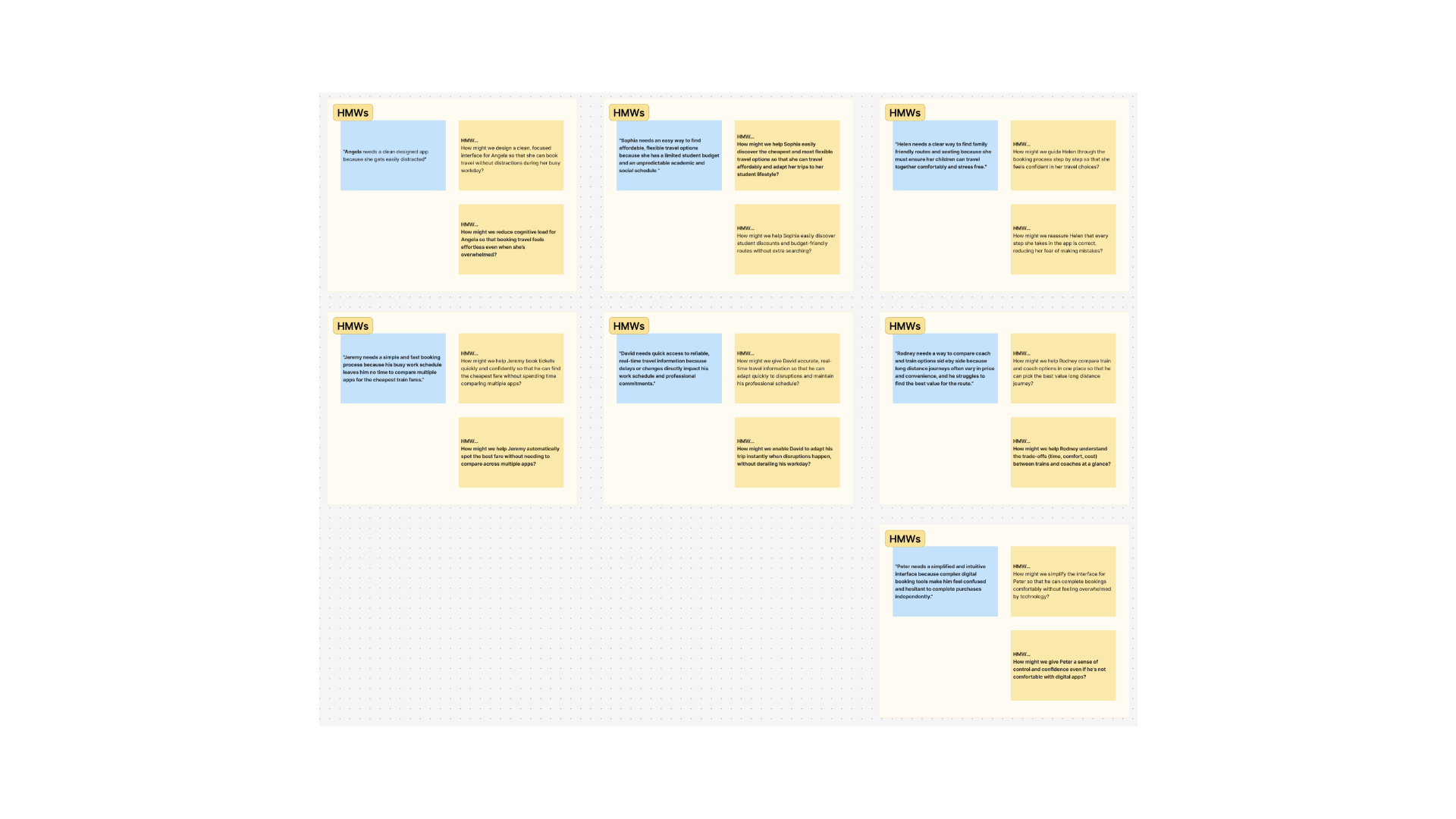
Problem Statements & How Might We
Problem statements identify a specific user need or pain point surfaced during research, keeping the design challenge user-focused and actionable. How Might We questions then open the problem back up — exploring diverse ideas without jumping straight to solutions.
"Angela needs a clean designed app because she gets easily distracted."
HMW: How might we design a clean, focused interface for Angela so that she can book travel without distractions during her busy workday?
"Jeremy needs a simple and fast booking process because his busy work schedule leaves him no time to compare multiple apps for the cheapest train fares."
HMW: How might we help Jeremy book tickets quickly and confidently, so he can find the cheapest fare without spending time comparing multiple apps?
How Might We — full set, mapped per persona
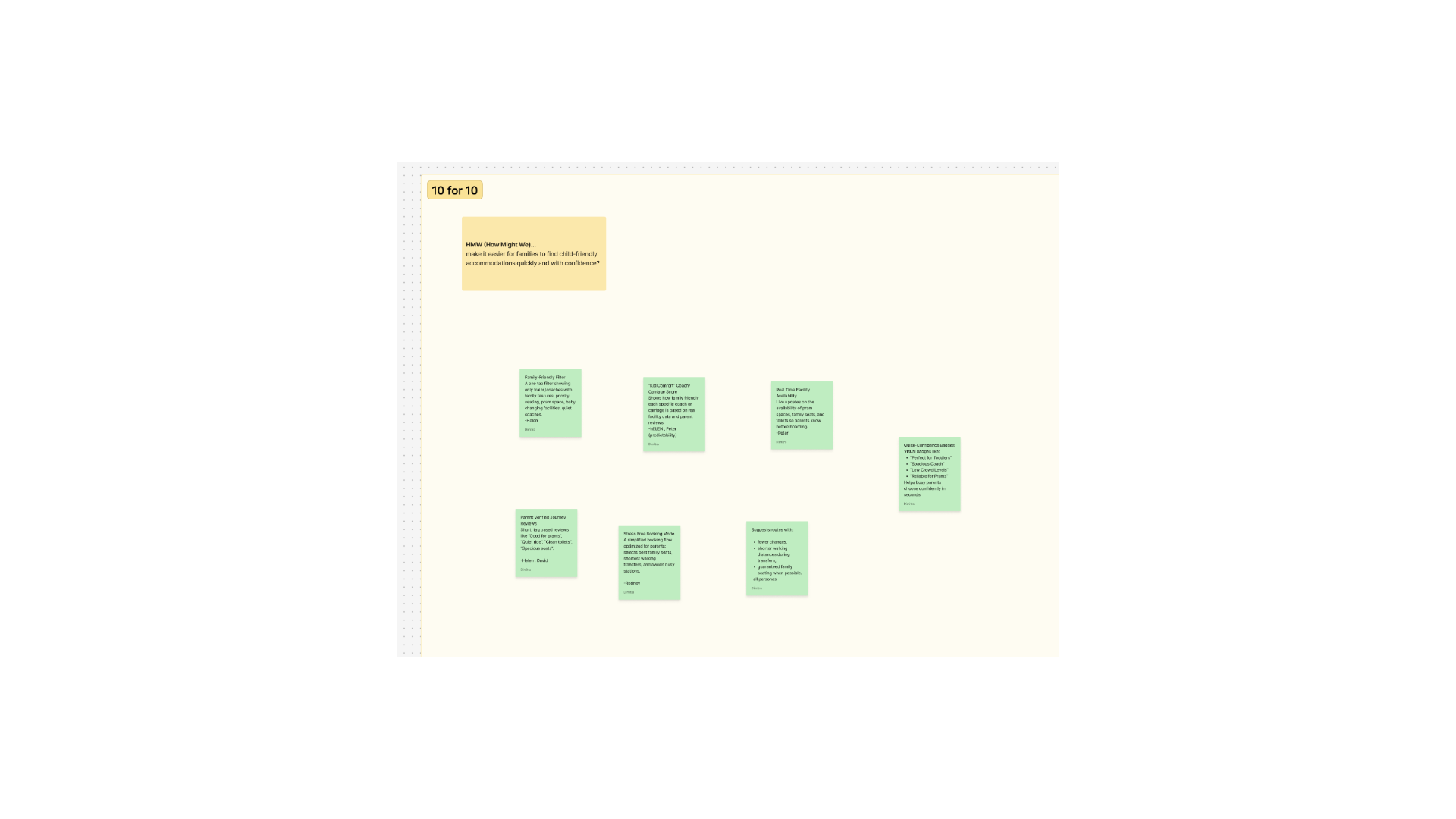
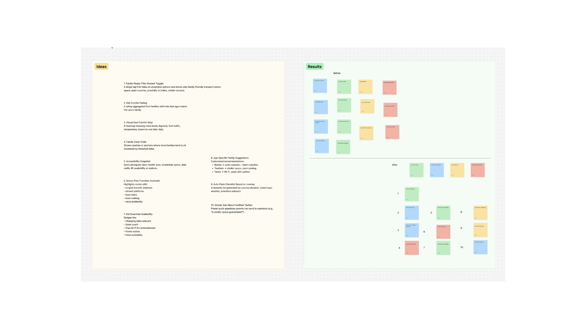
10 for 10 — one idea a minute, quick thinking over overanalysing
Final Design Challenge
"Design a booking journey that simplifies the process for the needs of every user. Overall, our research findings show that users mainly need an app that is transparent, clear, simple to understand and use — and that makes it easier for busy users or parents to use the app."
Ideate & Design Phase
From sketches to structure
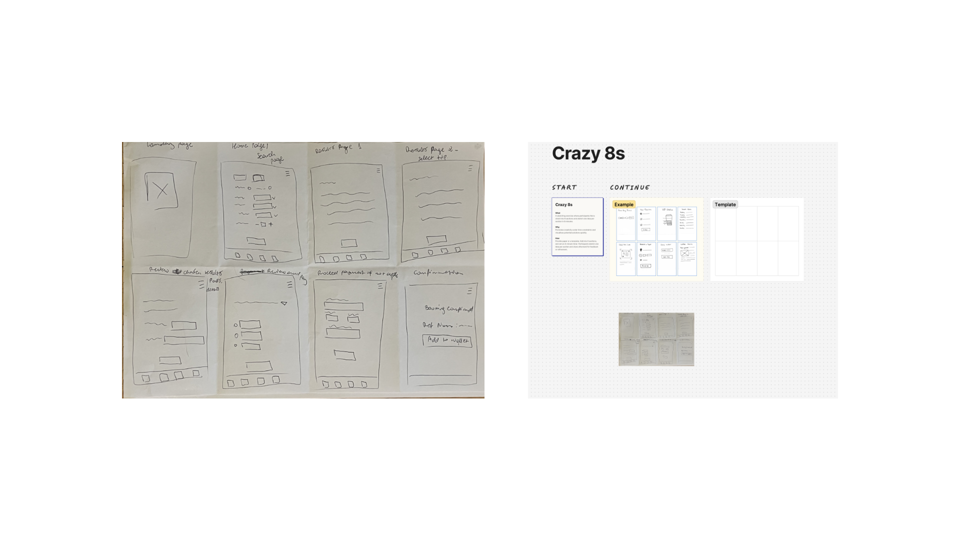
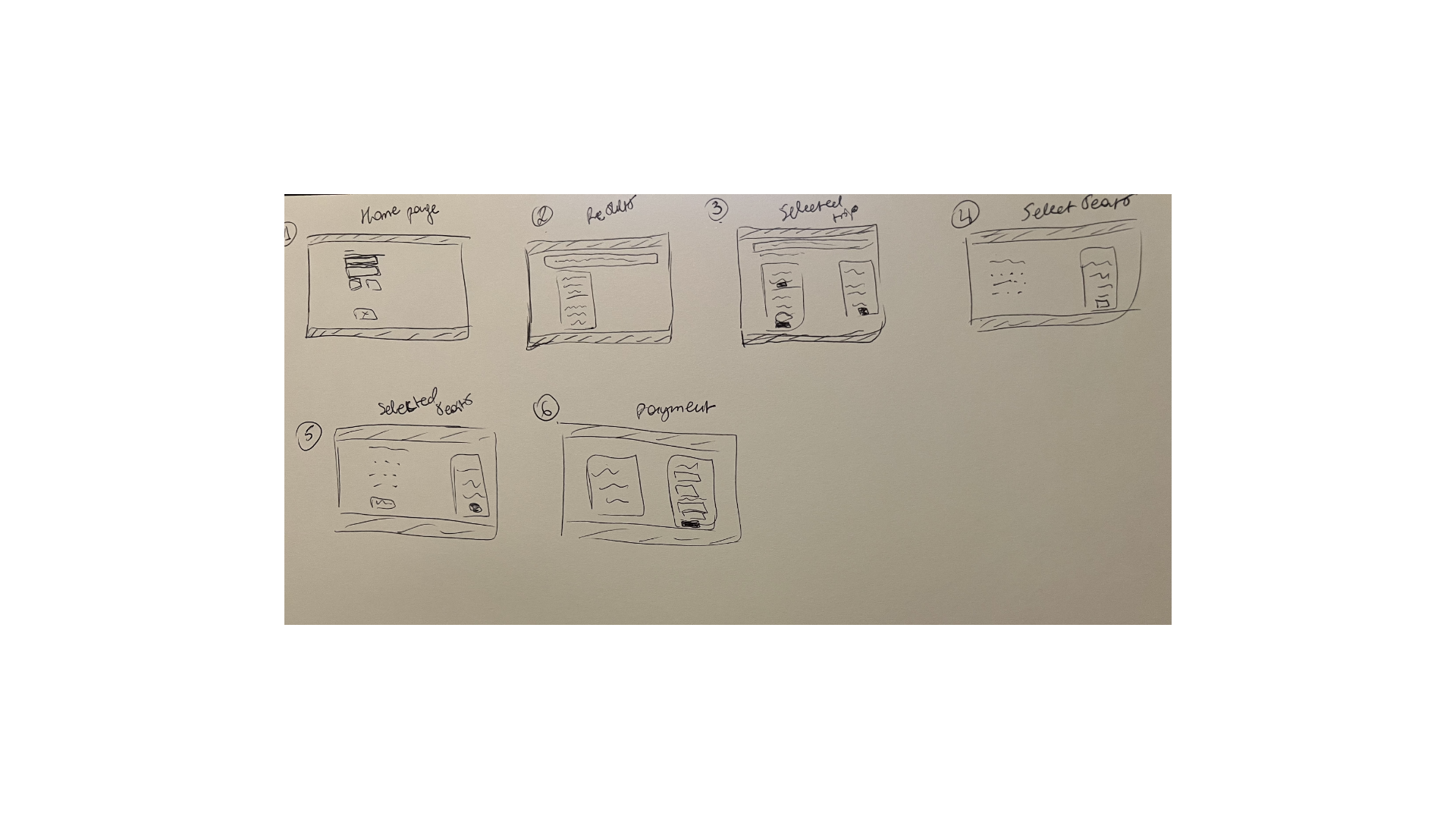
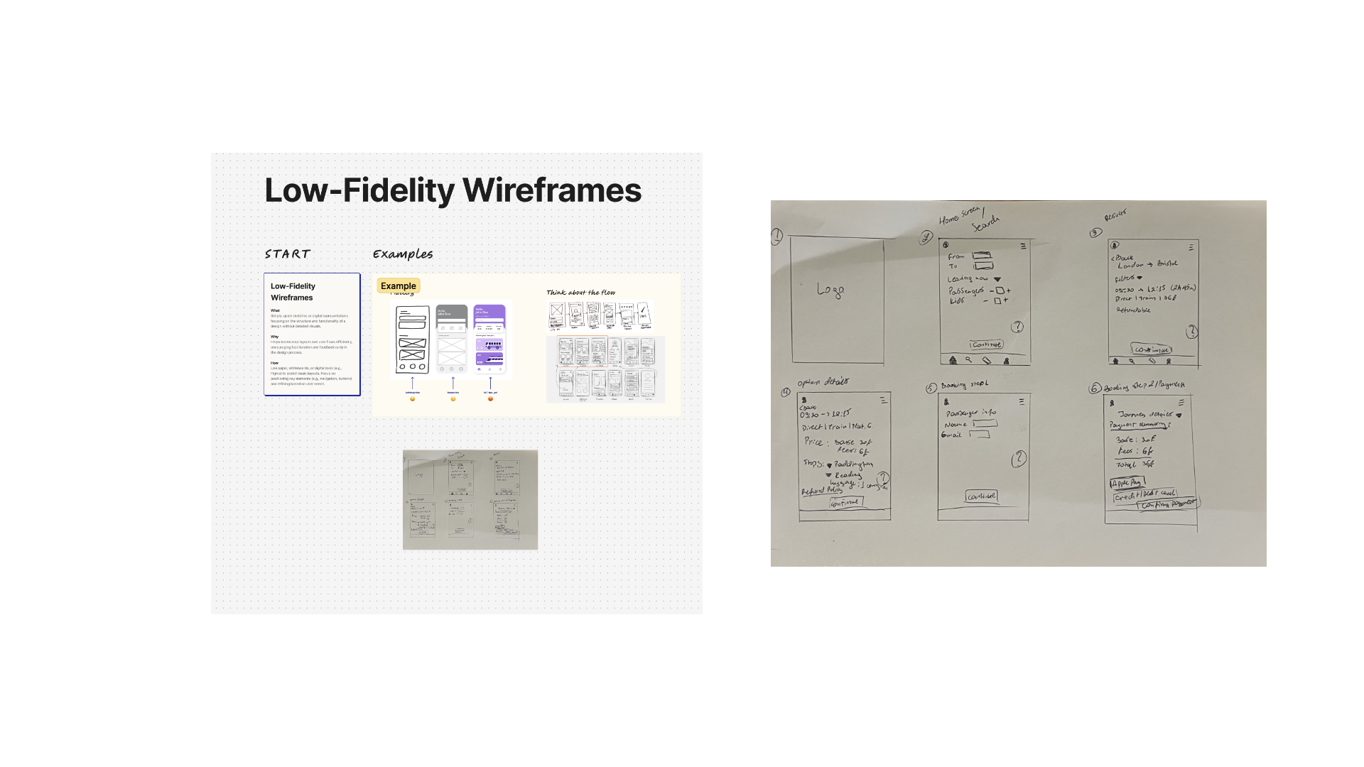
With pain points, opportunities and user needs identified, the design phase began with rapid ideation — Crazy 8s to generate a wide spread of directions quickly — before narrowing into low-fidelity wireframes for both desktop and mobile.
Crazy 8s
Ideate Solutions — 10 for 10
Desktop Wireframes
Mobile Lo-Fi Wireframes
Experimentation
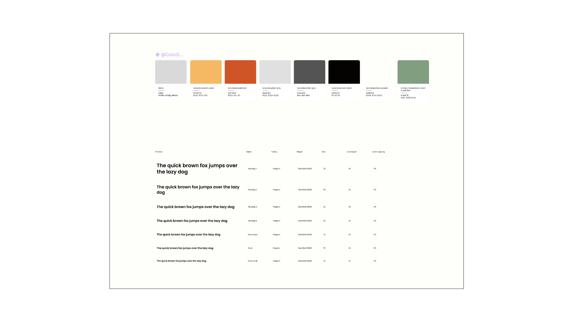
Design System
Style Guide & UI Elements
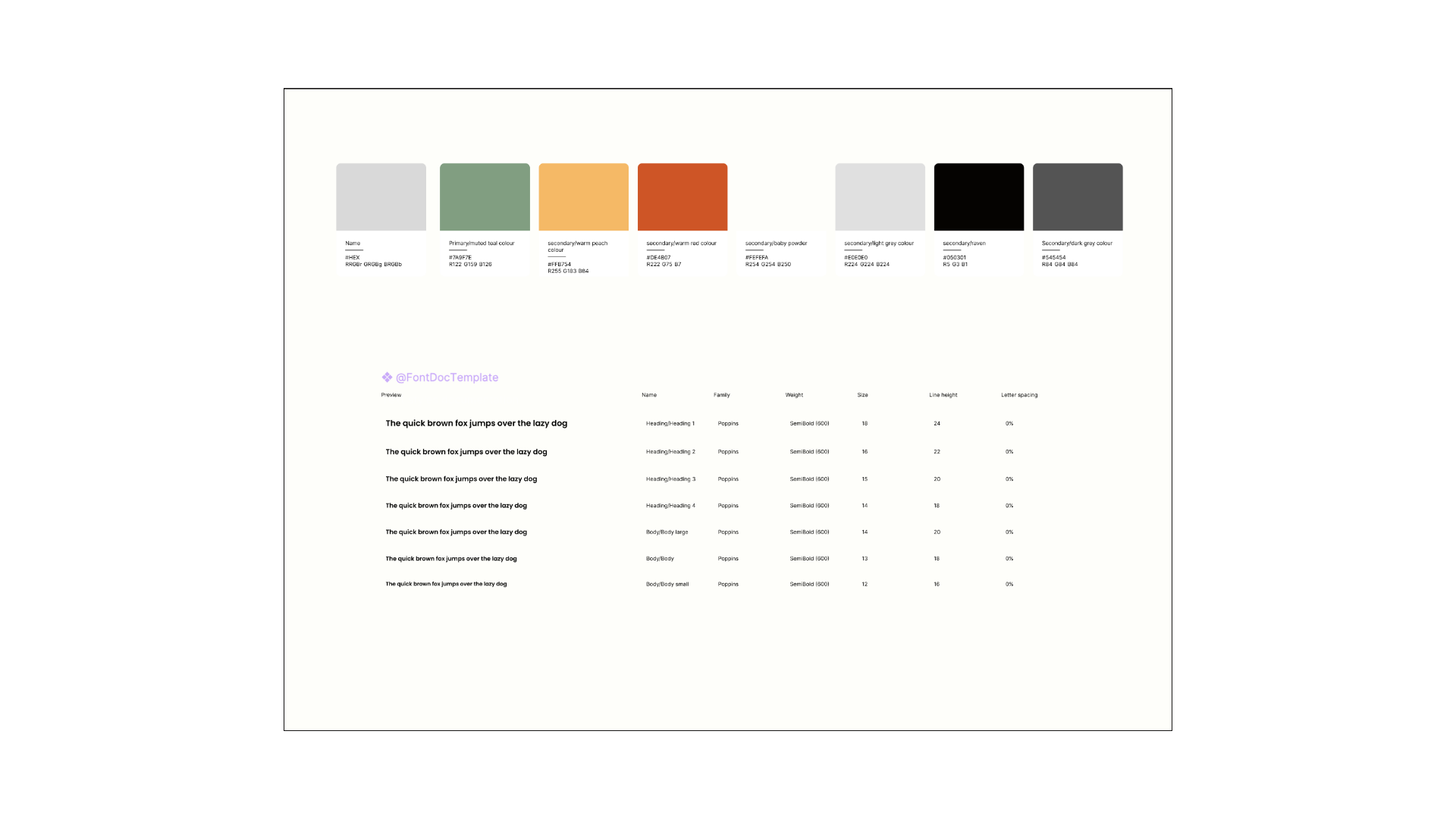
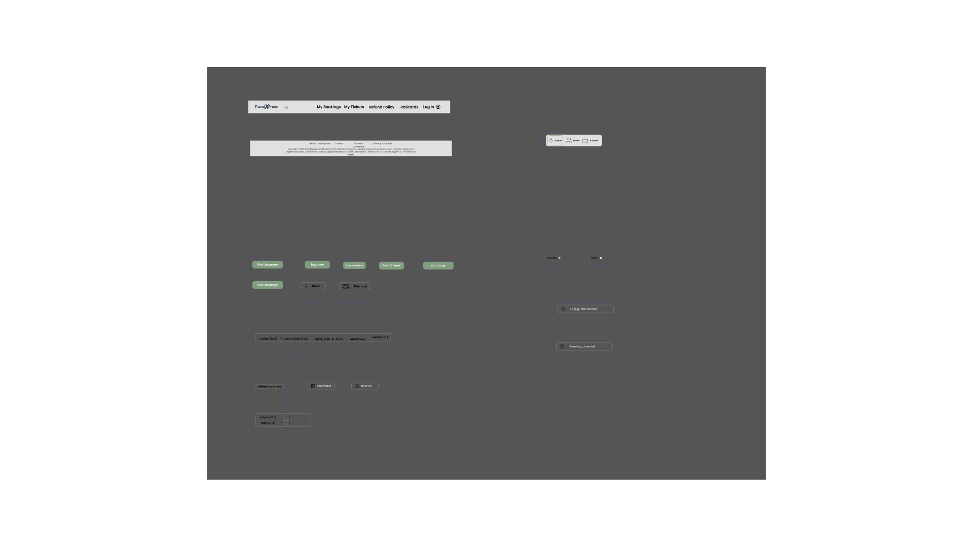
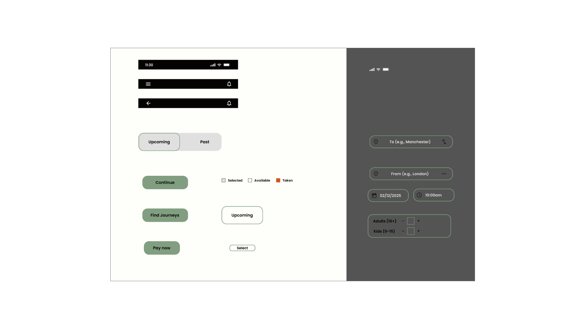
A consistent colour palette, type scale and component library were established across desktop and mobile to keep the interface coherent, accessible and easy to build from.
#7A9F7E
Primary — muted teal
#FFB754
Secondary — warm peach
#DE4B07
Secondary — warm red
#E0E0E0
Secondary — light grey
#545454
Secondary — dark grey
#050301
Secondary — raven black
#FEFEFA
Secondary — baby powder
Typeface — Poppins, SemiBold 600, scaled from a 14px body copy up to a 32px H1.
Auto Layout
Prototyping
Desktop & Mobile Prototypes
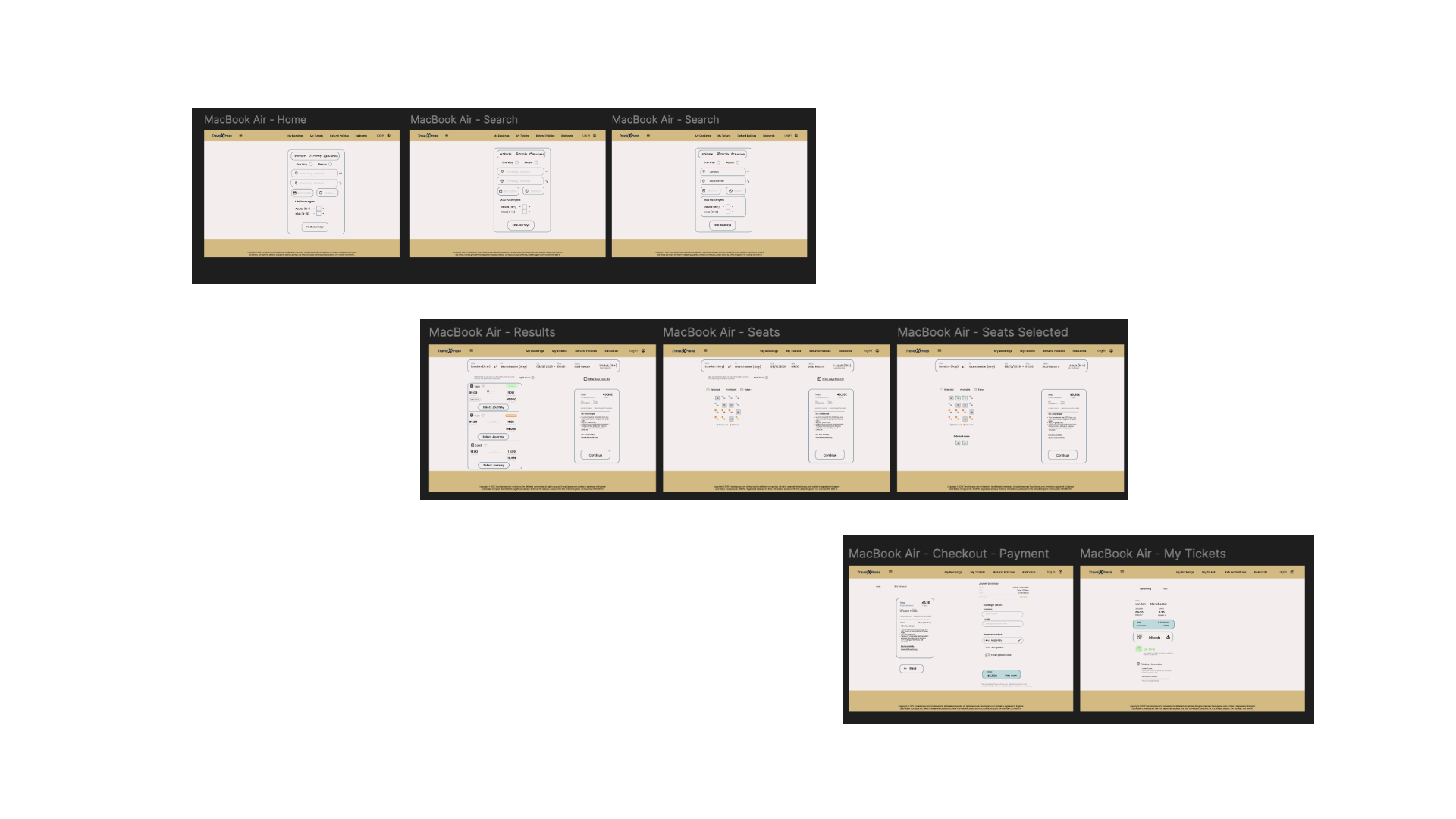
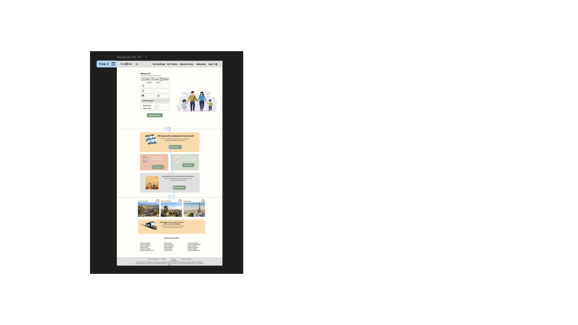
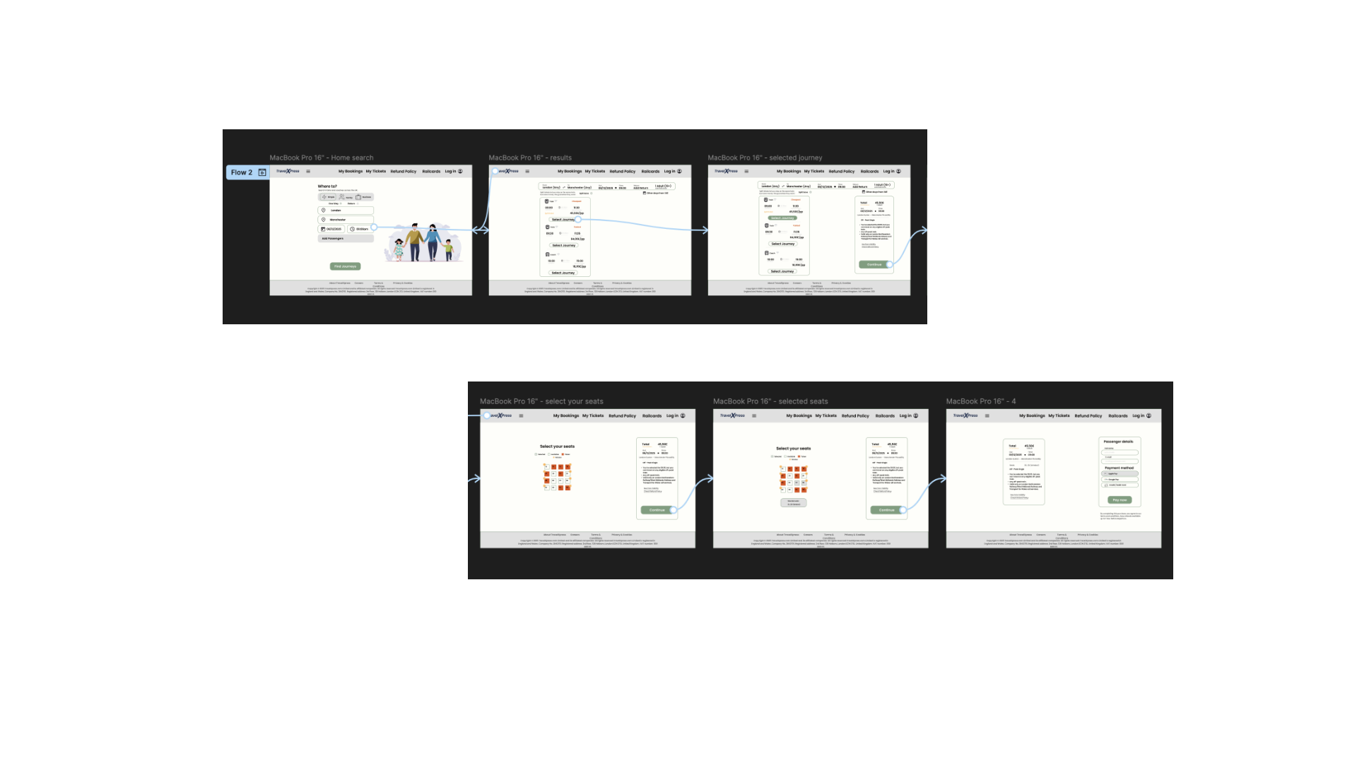
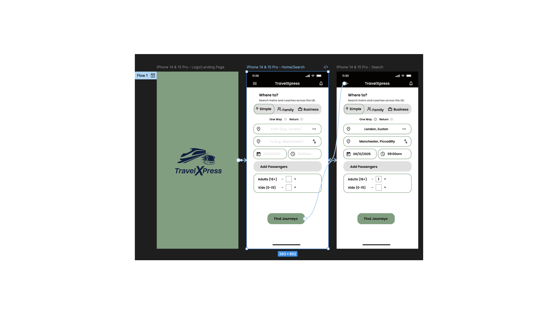
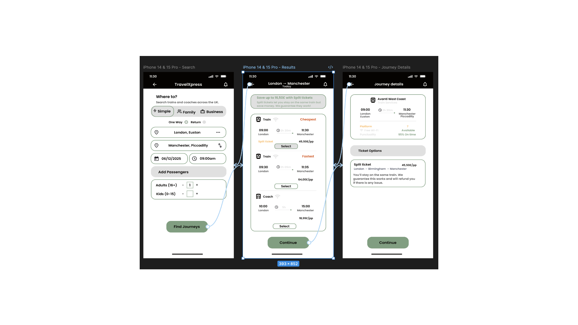
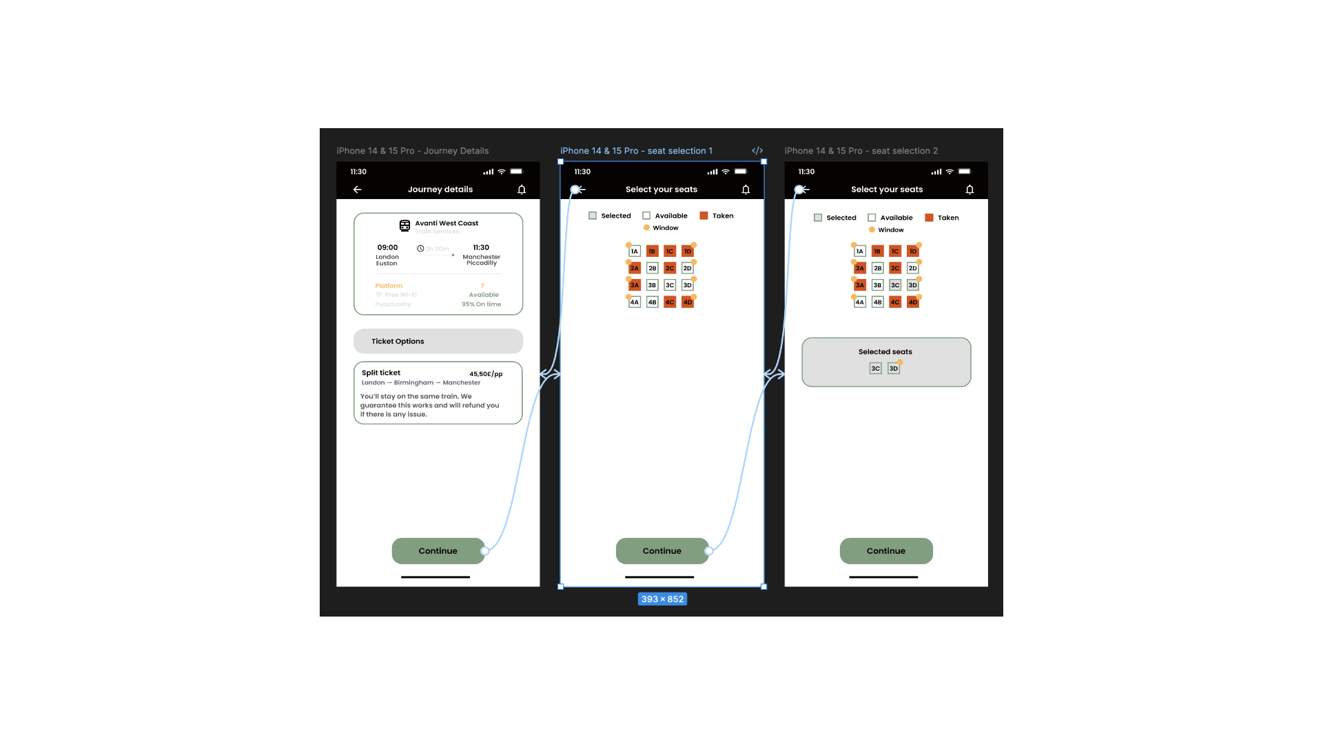
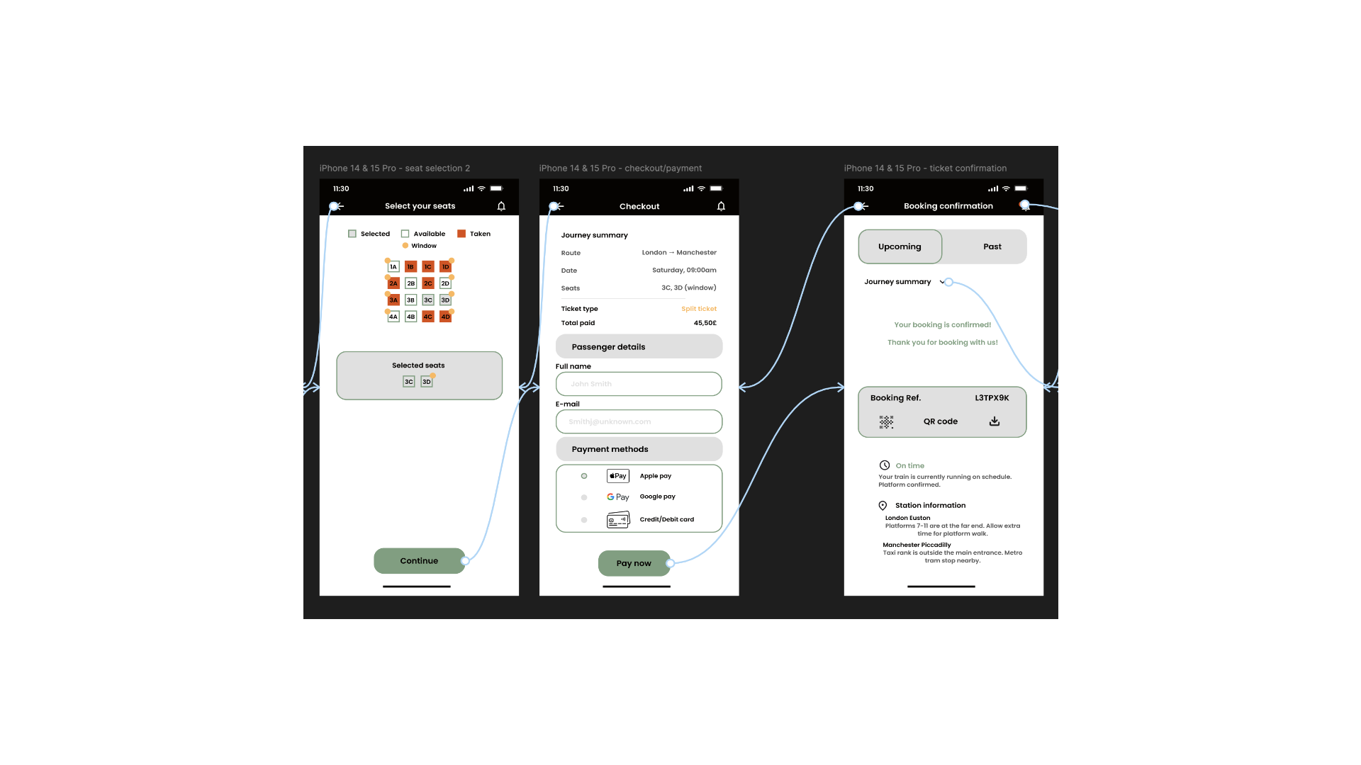
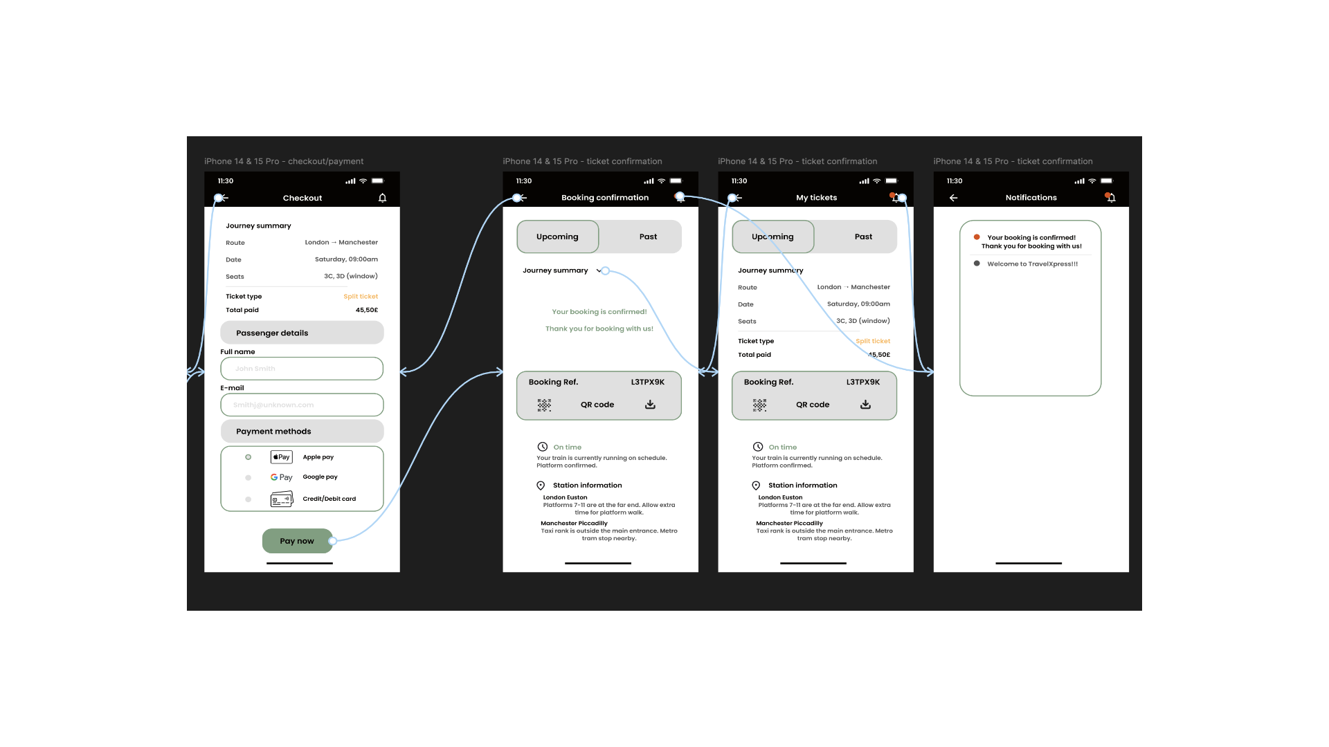
Interactive, connected prototypes were built in Figma across both desktop and mobile — from landing and search through to seat selection, passenger details and confirmation — to test the full booking flow end to end.
Desktop Prototype
Mobile Prototype — iPhone 14 & 15 Pro
Reflection & Next Steps
What the process revealed
Combining primary and secondary research proved essential to uncovering deeper user insight. Interviews, surveys, journey mapping, desk research and social scraping each assisted in building a fuller understanding of user behaviour, needs and pain points than any single method could alone.
With the data collected and categorised, the pain points, what works well, and the underlying user needs were identified — informing the move into lo-fi wireframes to prepare the app for its final design. These wireframes, and the prototyping that followed, will support further testing to validate whether the redesign is a genuine improvement.
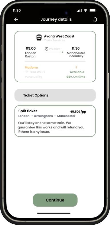
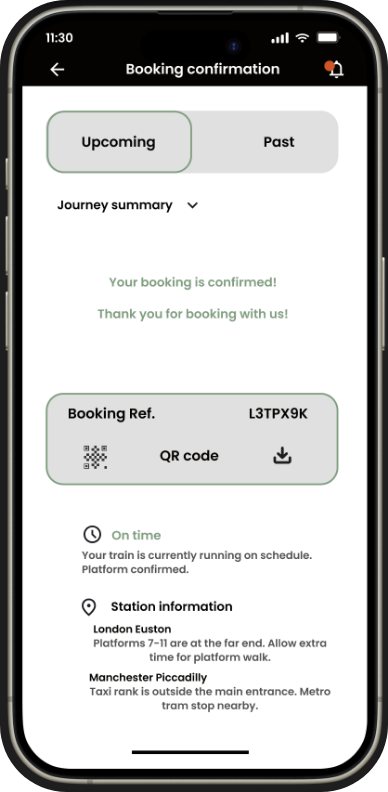
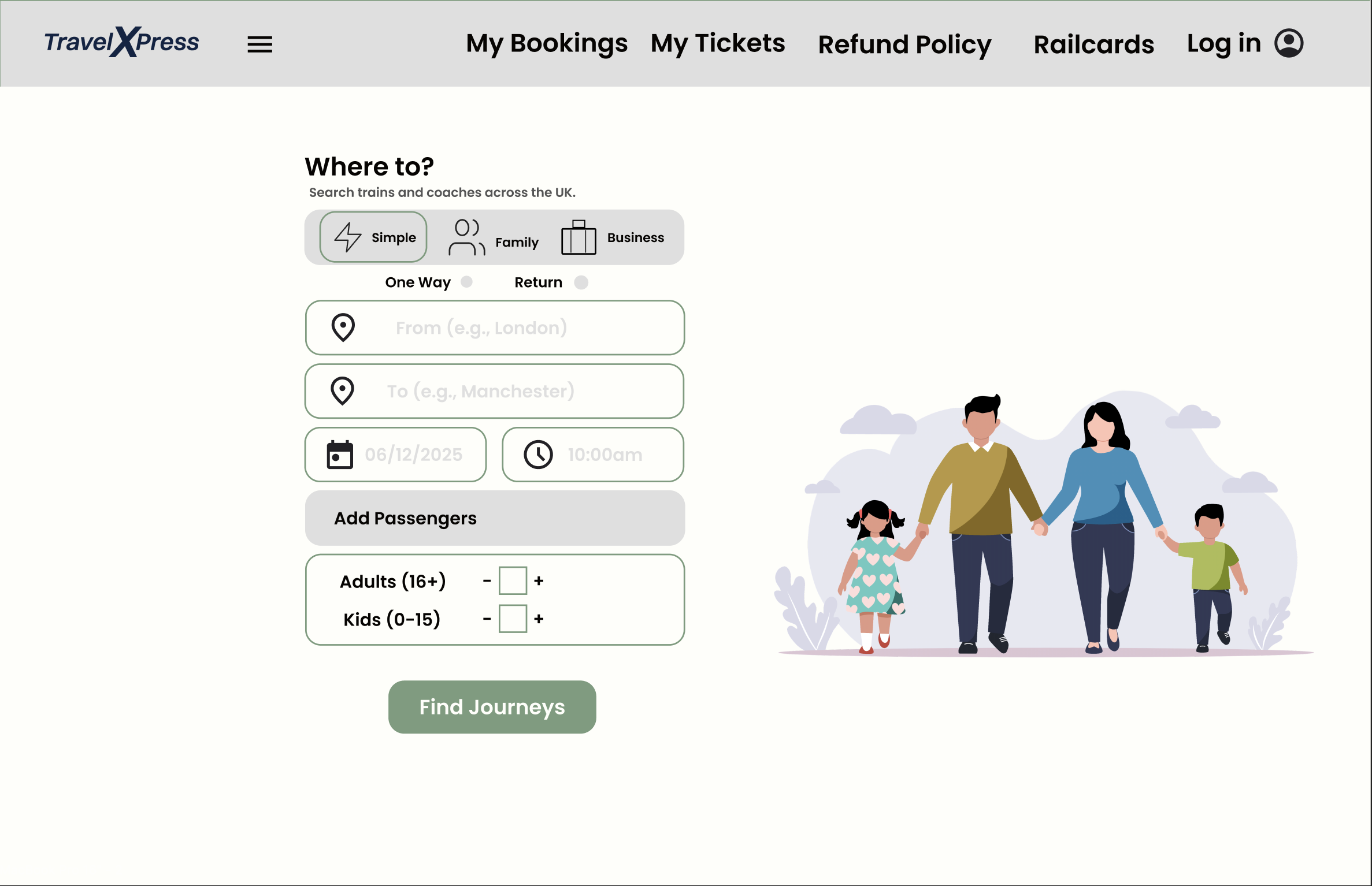
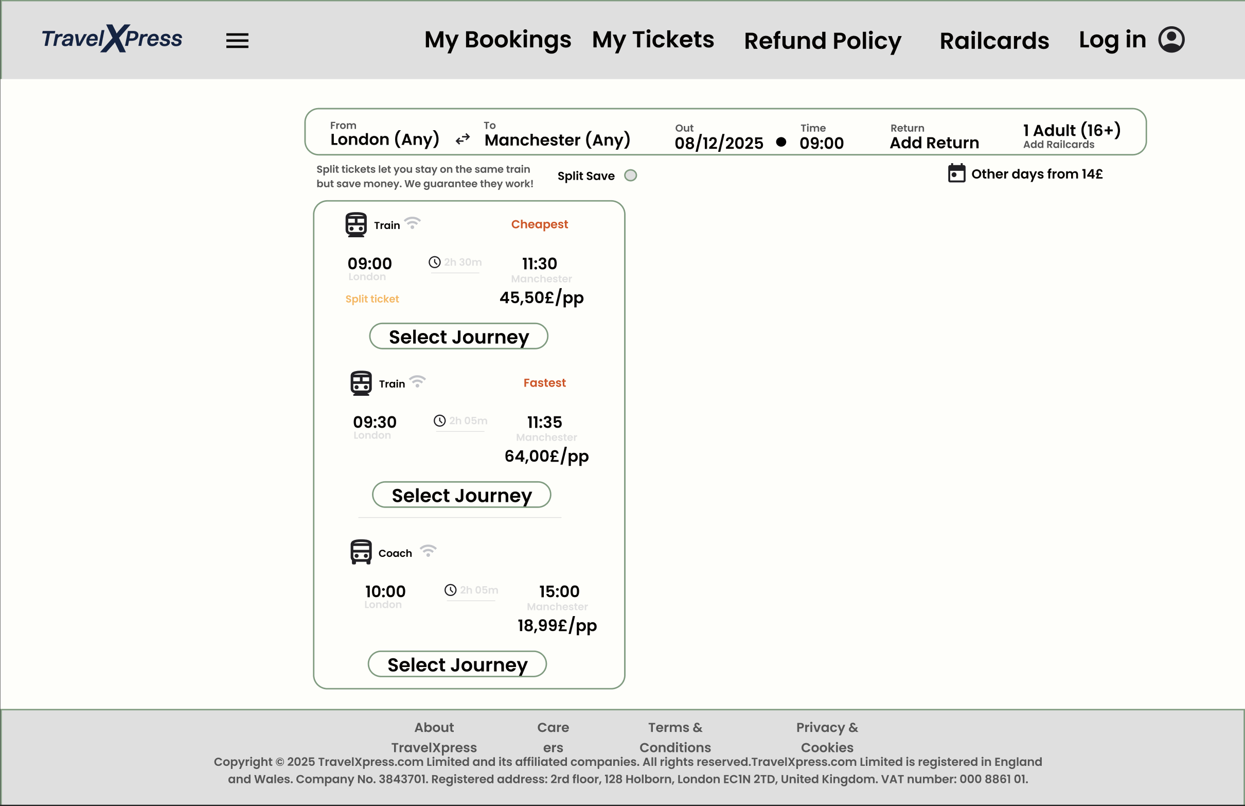
Final UI Design
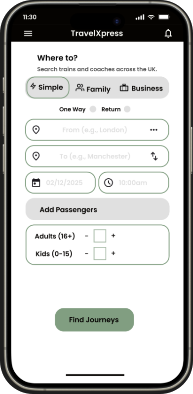
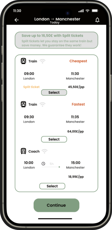
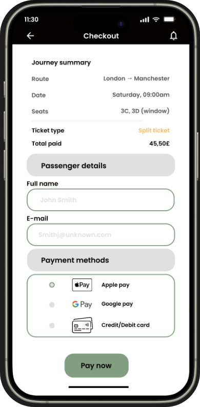
Final Mockups
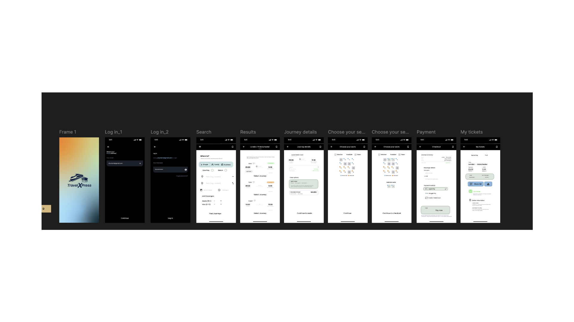
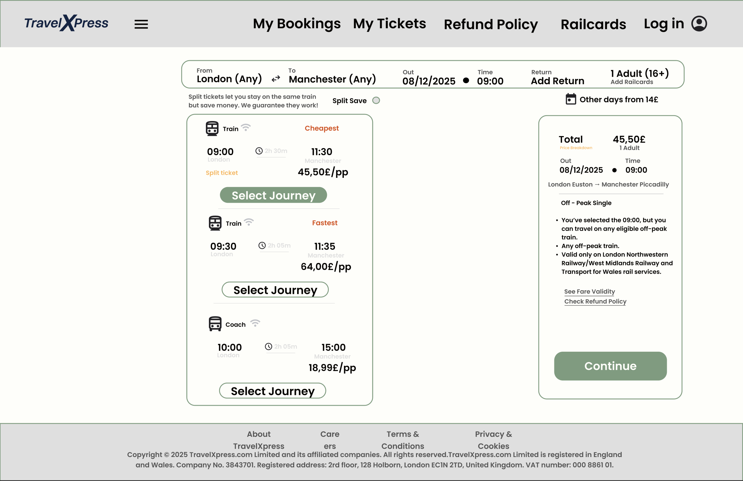
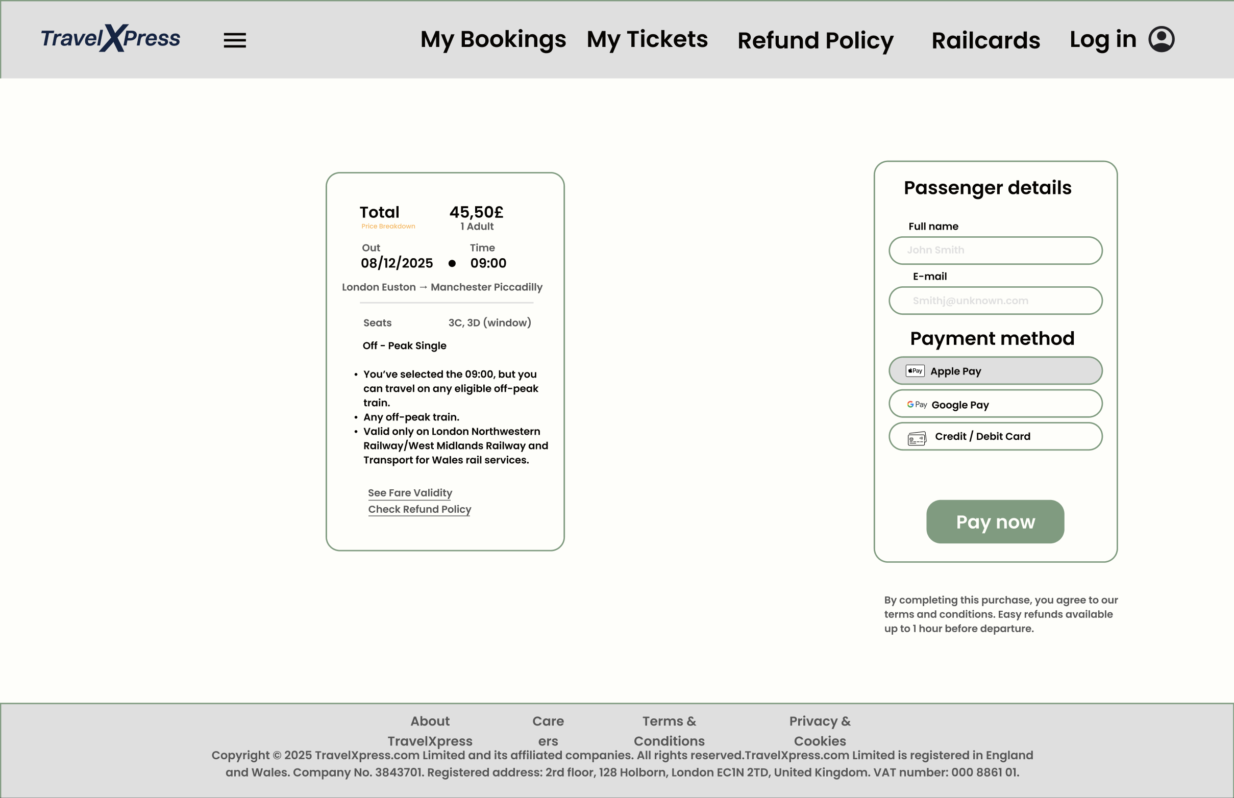
High-fidelity screens from the finished TravelXpress app, built from the design system above.
Home / SearchResultsJourney DetailsPassenger Details & PaymentConfirmation


Secondary Research
Social Scrape
A scrape of real user reviews and posts across social media, gathering unfiltered pain points directly from travellers describing their experiences with existing booking apps.
Frequent complaints about app crashes, freezing seat maps or payment resets show that technical reliability is a major expectation. Outcome: prioritise performance improvements, smooth load times and resilient payment flows.
Users consistently express frustration when delays or timetable changes in the app don't match what's shown at the station. Outcome: synchronising data sources and offering more reliable real-time updates is essential to credibility.
Negative posts highlight confusion when trains or coaches labelled as "available" cannot actually be booked. Outcome: clear status indicators — sold out, limited seats, not bookable — reduce confusion and improve control.
Auto-applied discounts, saved passenger details and quick mobile ticket access repeatedly receive praise. Outcome: enhancing these "micro-conveniences" can significantly boost perceived value and delight.
Many posts request clearer alternatives, guidance or explanations when delays occur. Outcome: adding disruption navigation — rerouting options, next fastest journey, easy refunds — can reduce anxiety in critical moments.
People frequently check Twitter/X, Reddit or station staff for platform info, crowd levels or alternative routes. Outcome: incorporating platform alerts, crowd data and multi-modal suggestions creates a more complete ecosystem within the app.
Social comments reveal that users struggle with unclear or laggy seat maps, especially on mobile. Outcome: a clearer, more responsive seat-selection interface is essential for usability and conversion.
Late-evening travellers often mention feeling unsafe or unsure about where to wait for their coach. Outcome: detailed pickup visuals, lighting indicators and AR/map guidance can improve safety perception and reduce stress.
People openly compare screenshots, fares and apps when searching for the cheapest or fastest route. Outcome: integrating price-comparison tools or fare insights could reduce the need to juggle multiple apps.
Requests for quiet coach filters, seat preferences and crowd-level estimates suggest deeper personalisation is desired. Outcome: offering personalised recommendations can improve loyalty and make the booking experience feel tailored.